
NORRAMCO
Norramco — Logistics & Transportation Brand Identity
Norramco operates internationally, with a substantial fleet connecting ports and markets across every continent. The challenge was to create a logistics brand identity that could reflect the scale of the business while giving the company a stronger and more distinctive position within the shipping and transportation industry.
Ships, waves, anchors and nautical symbols are an obvious way to communicate the category. They also make it difficult to build recognition. When logistics and shipping companies rely on the same visual language, the industry becomes clear but the individual brand tends to disappear.
The first step was therefore to look beyond the expected codes of maritime branding and understand what could give Norramco a more ownable position. The starting point was not simply what the company does, but what defines the business: movement, direction and connection. These became the principles around which the brand strategy and visual identity were developed.
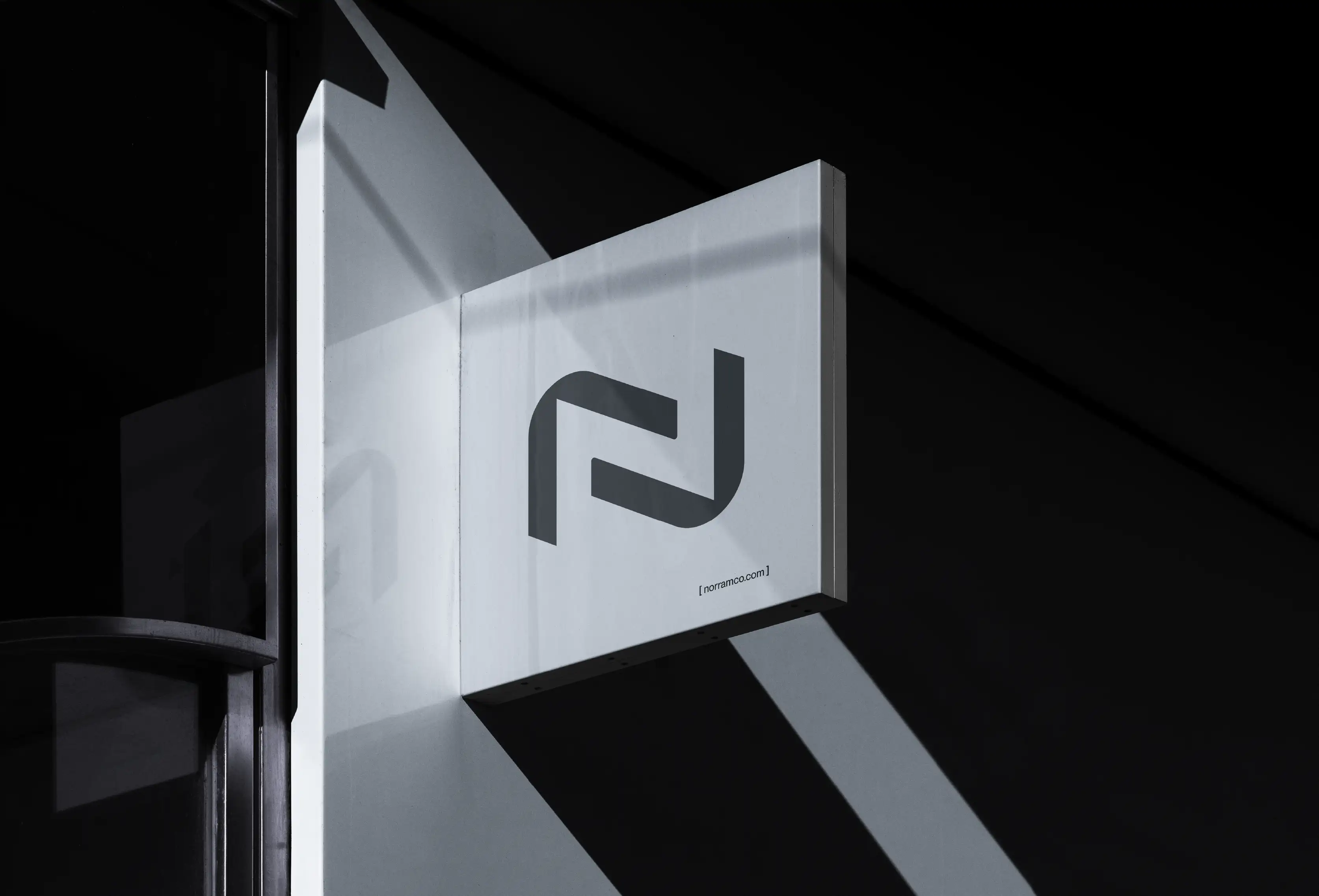
The bow of a ship was reduced to its simplest geometric form and turned into an arrow. Two of these shapes come together to create the N of Norramco, making the logo directly connected to the name rather than simply illustrative of the sector. The result is a distinctive mark that works as a corporate signature while retaining a clear connection to Norramco’s role in logistics and transportation.
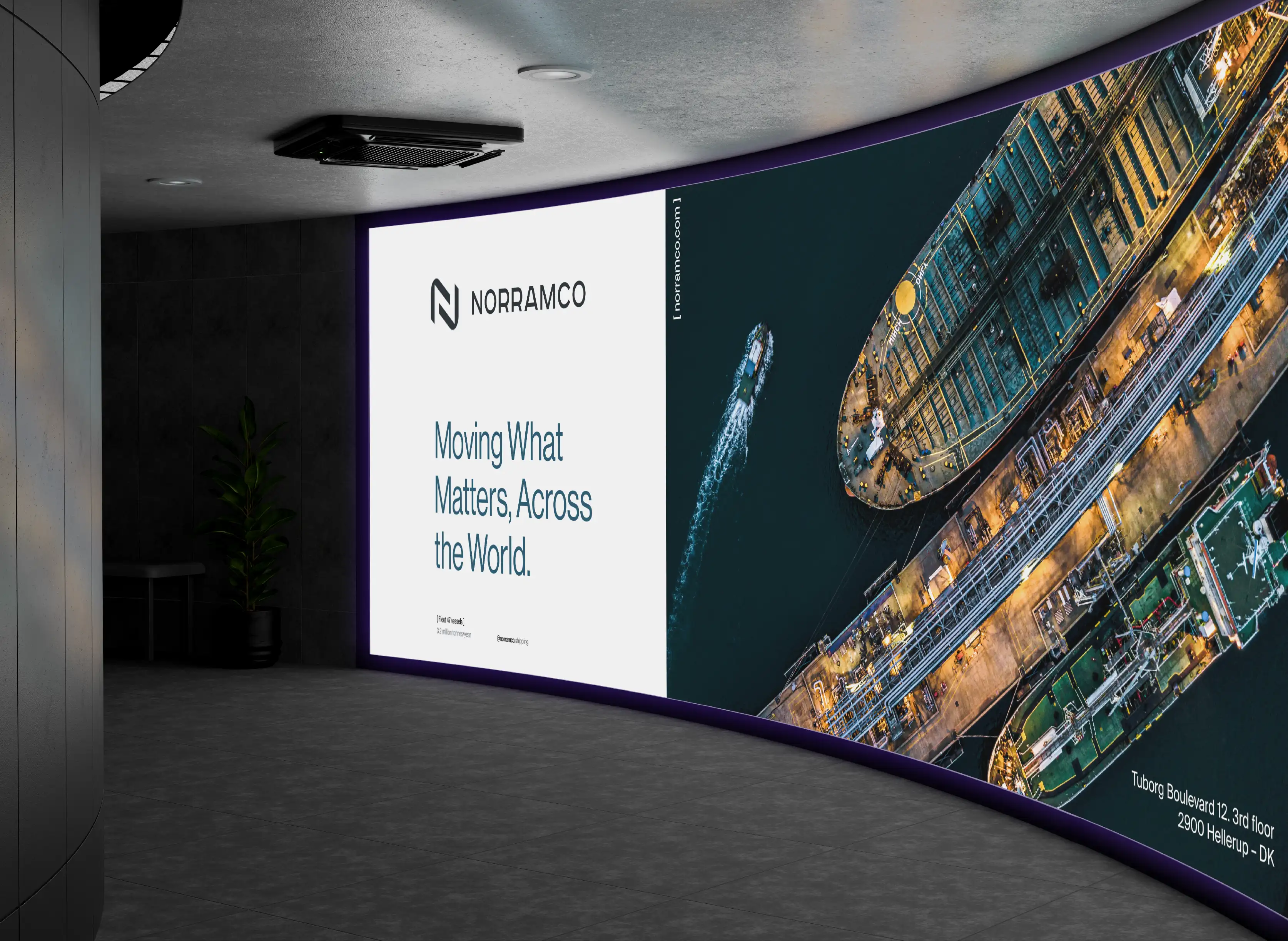
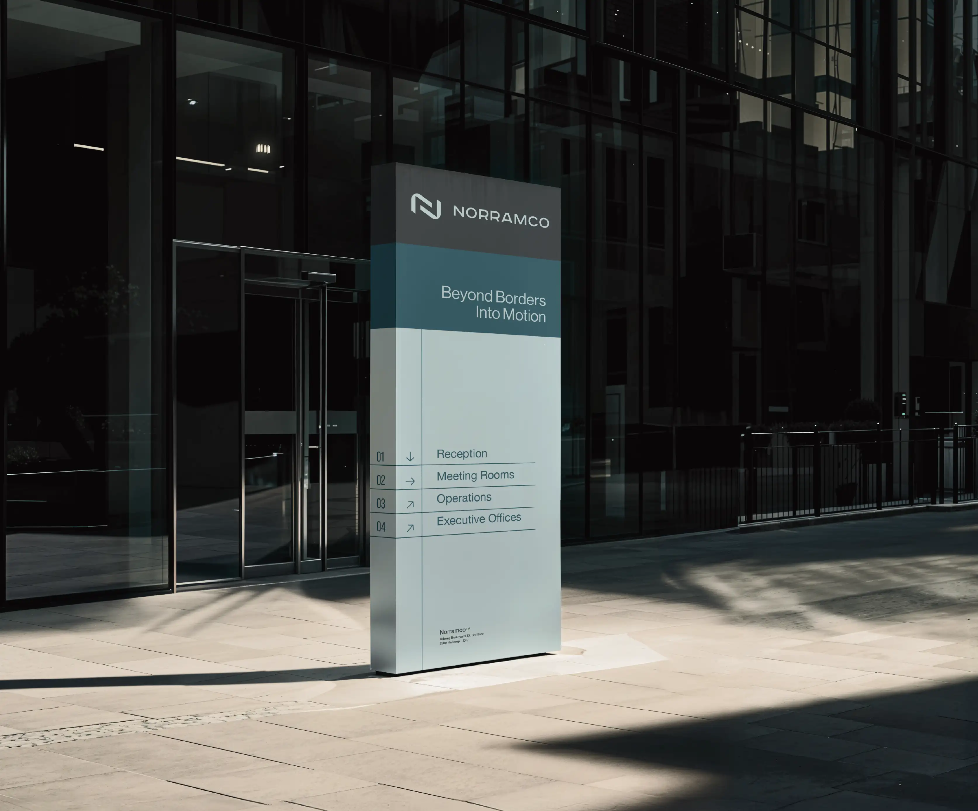
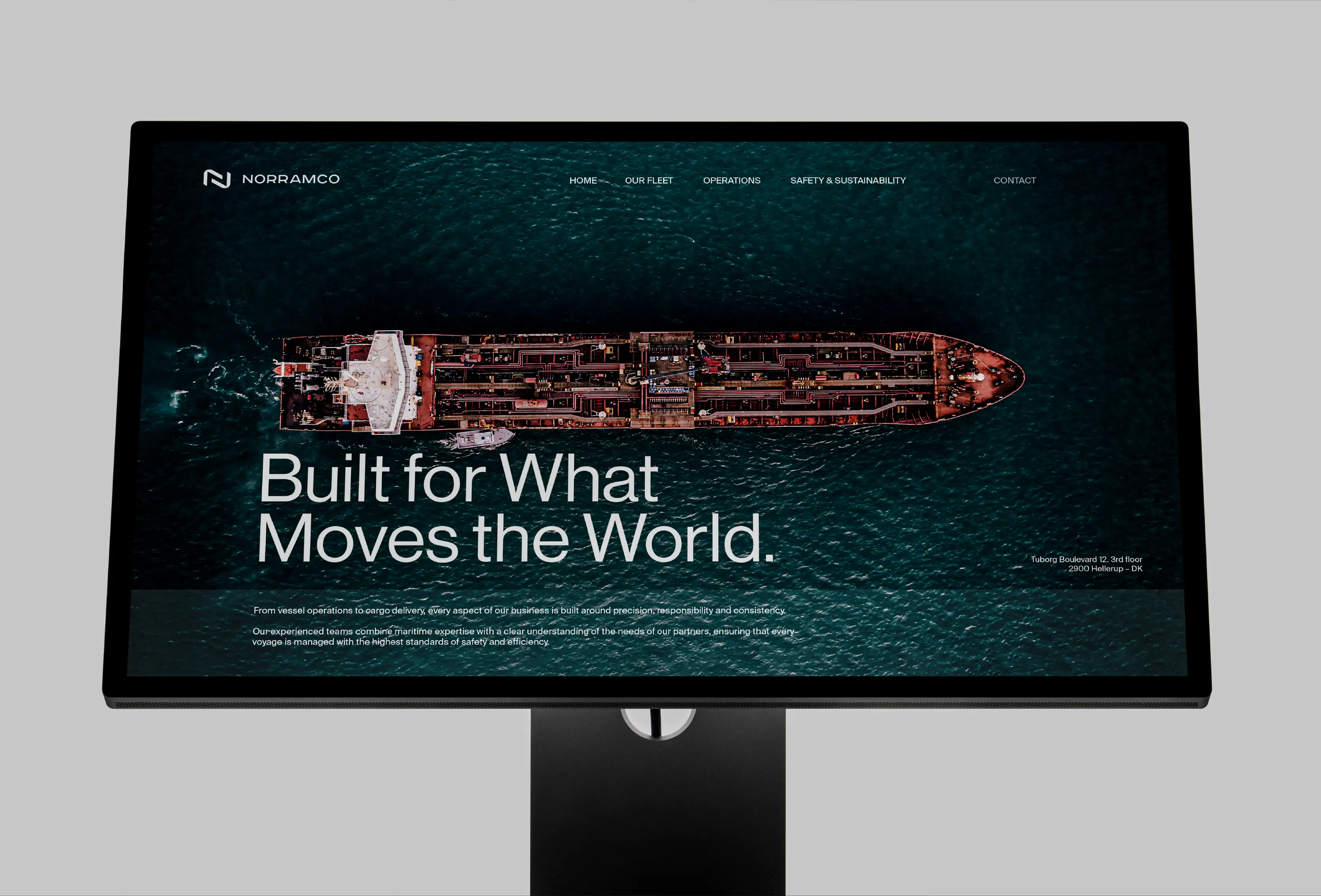
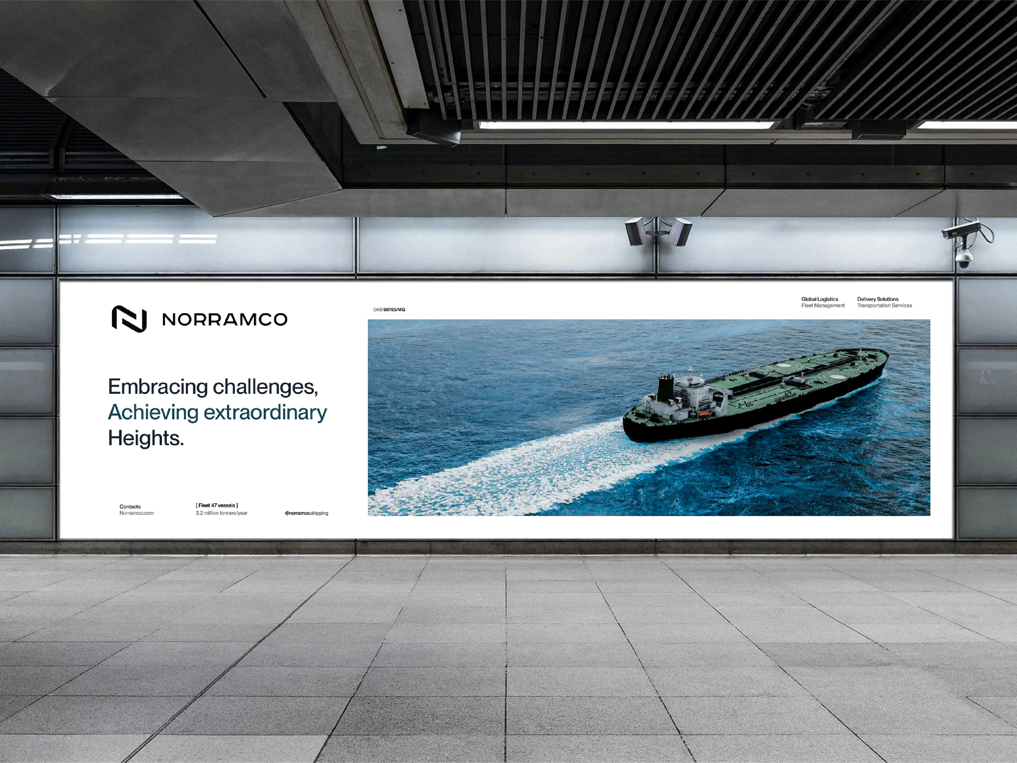
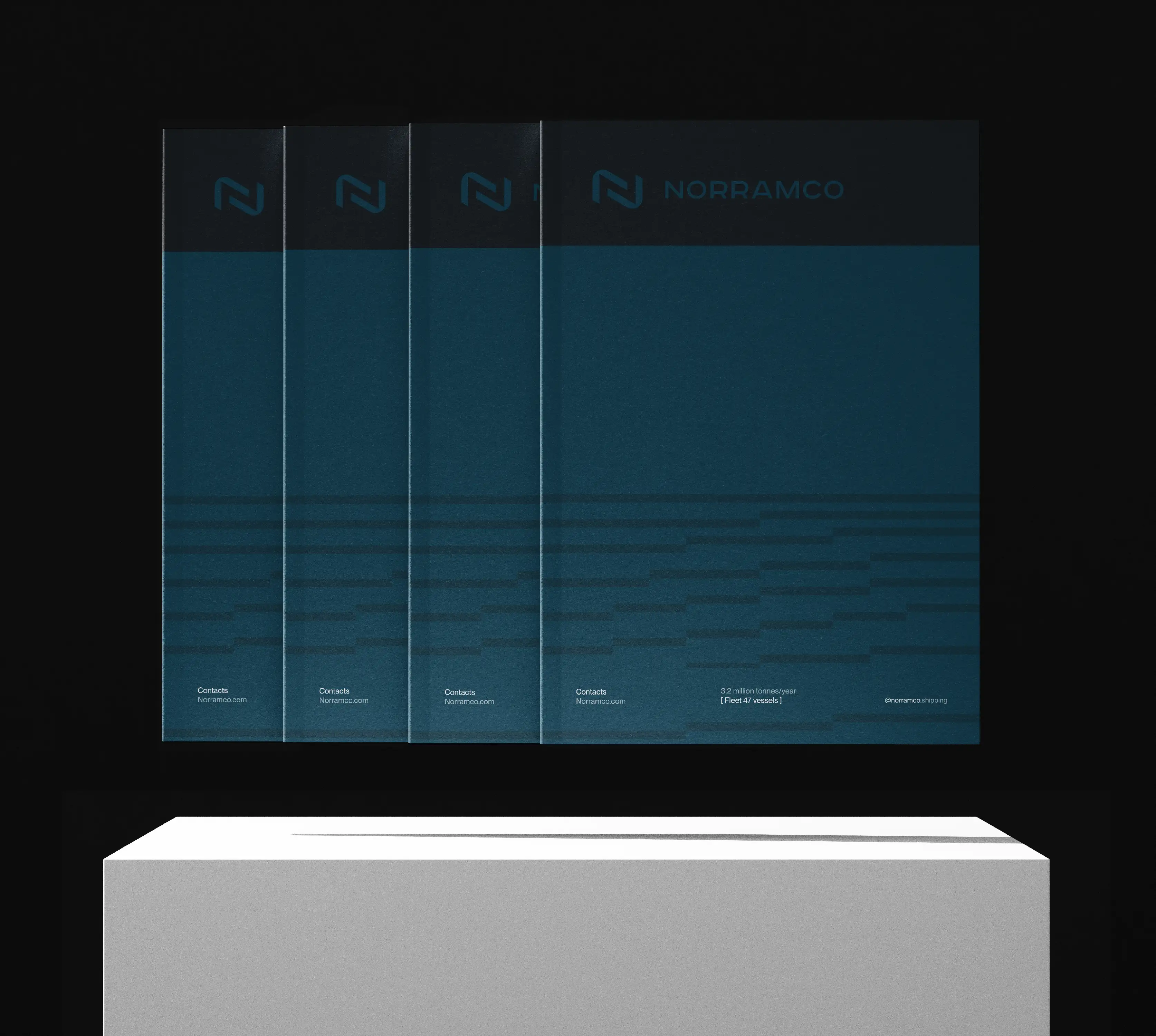
From there, the logistics branding was developed as a complete visual system rather than a standalone logo. Deep ocean tones combined with colours inspired by unrefined oil reference Norramco’s maritime and industrial environment without resorting to literal imagery. A restrained geometric language gives the transportation brand identity a sharper, more contemporary character, helping the company move away from the conventional look of shipping and logistics brands.
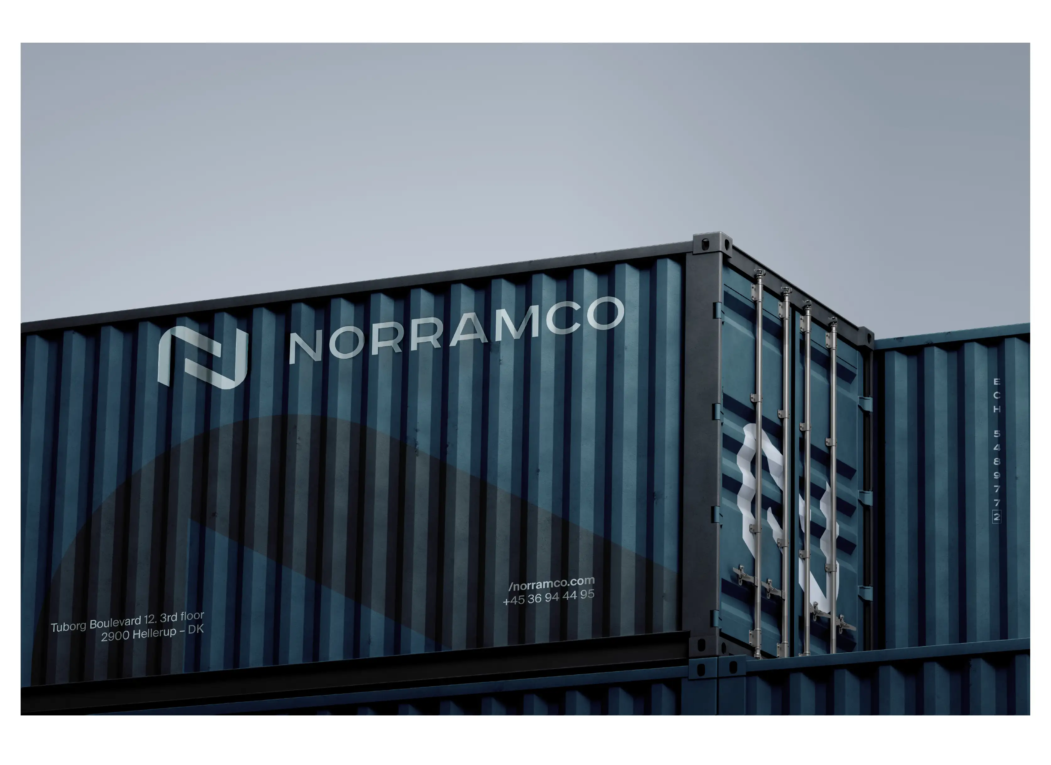
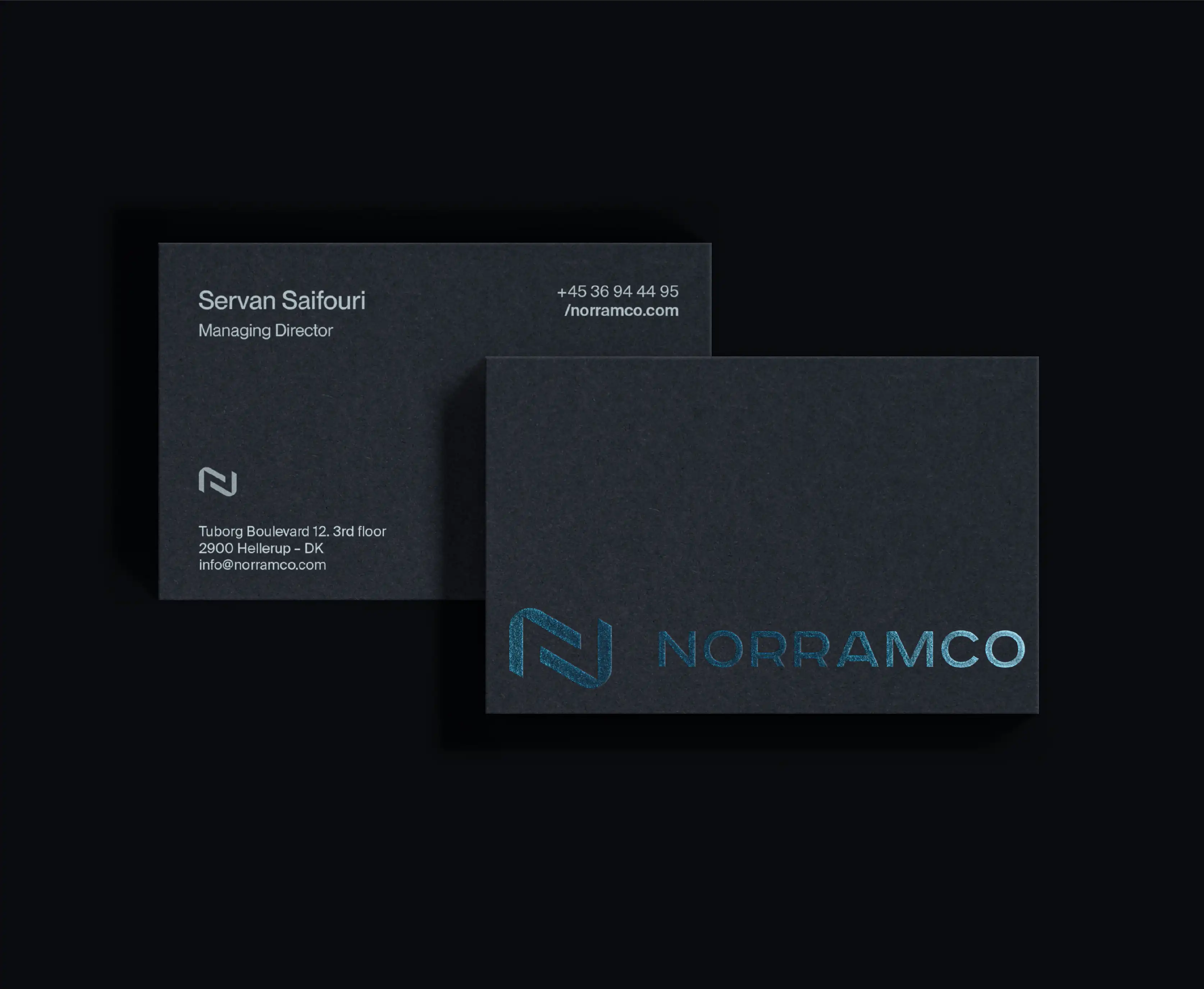
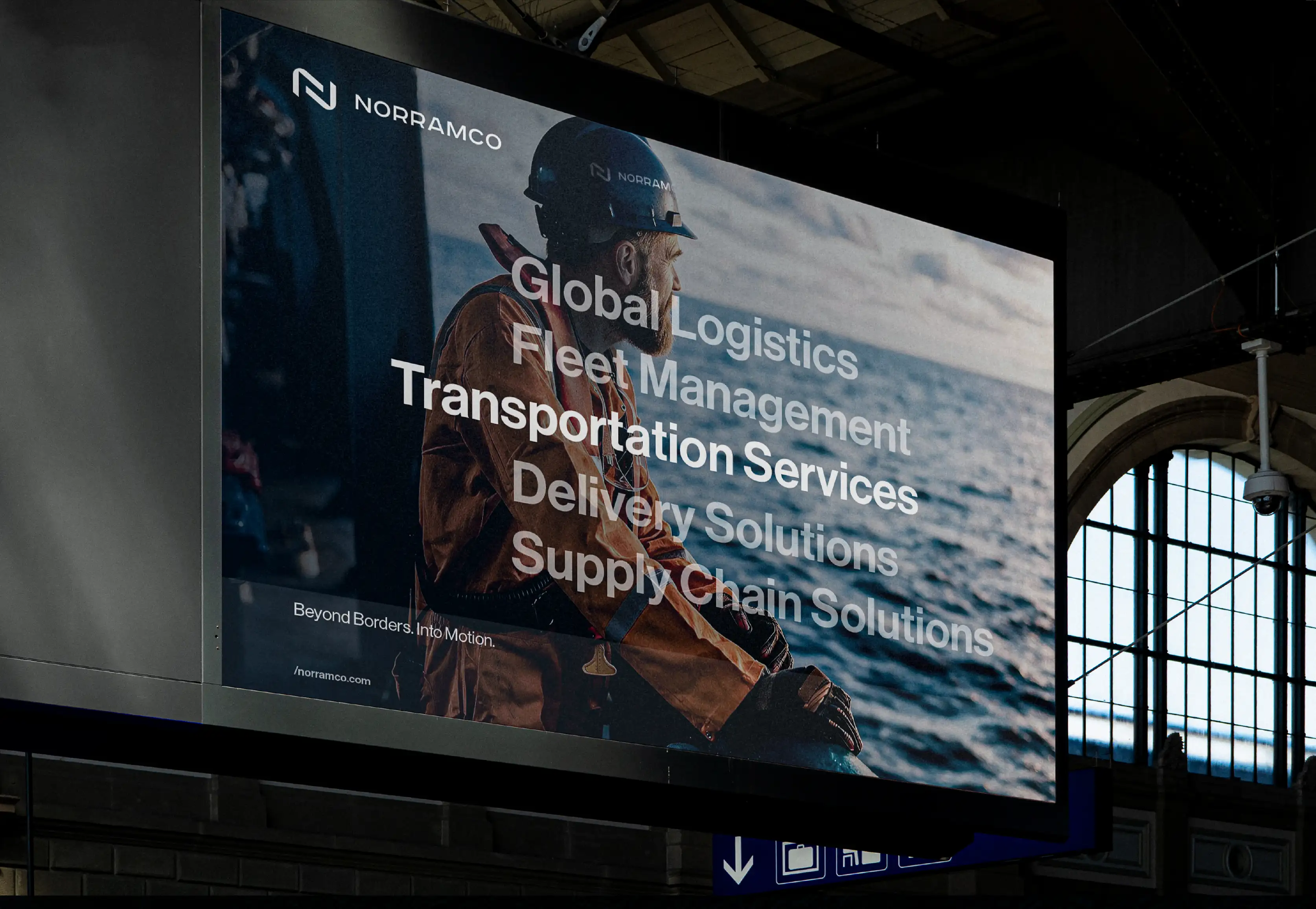
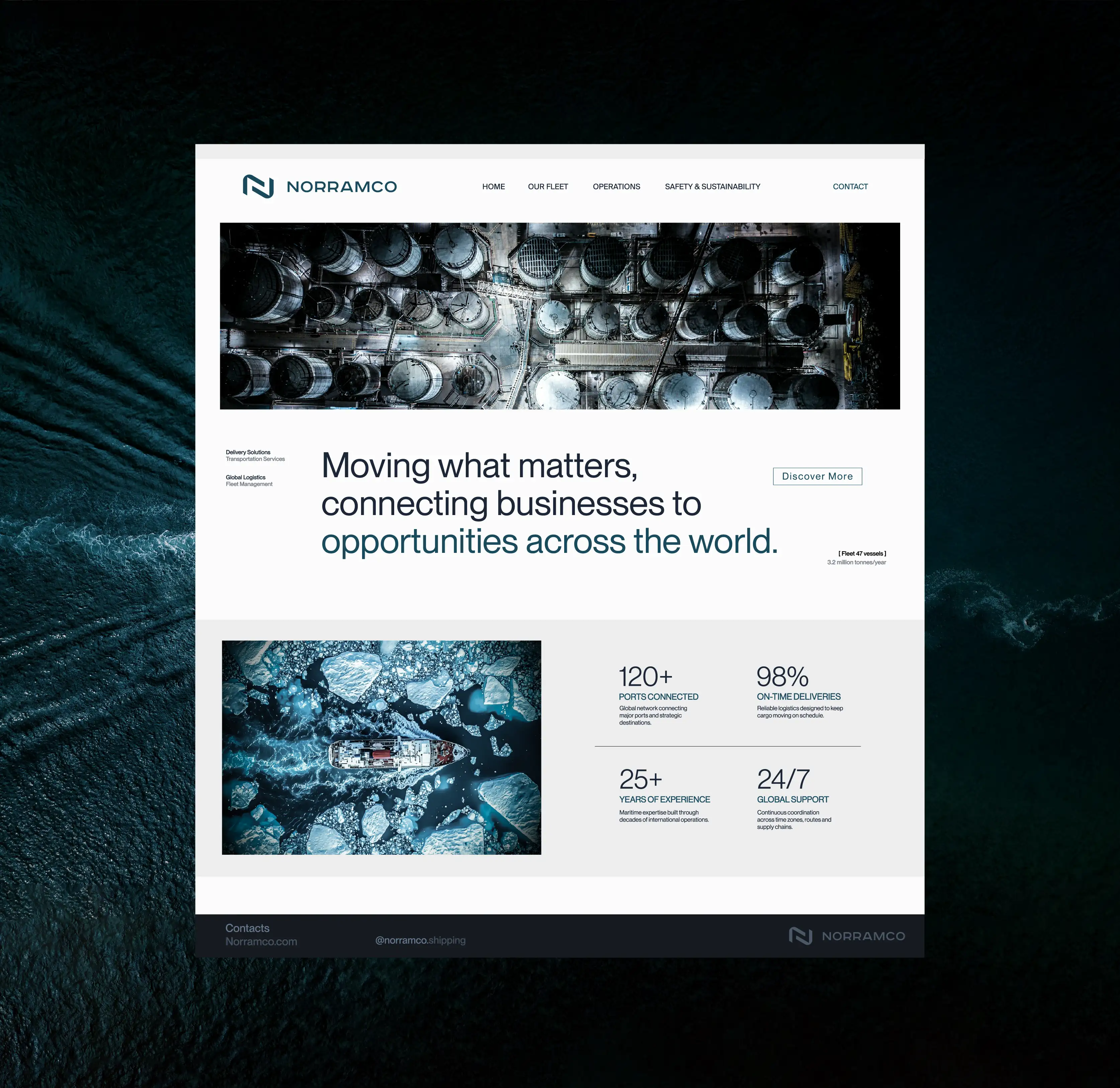
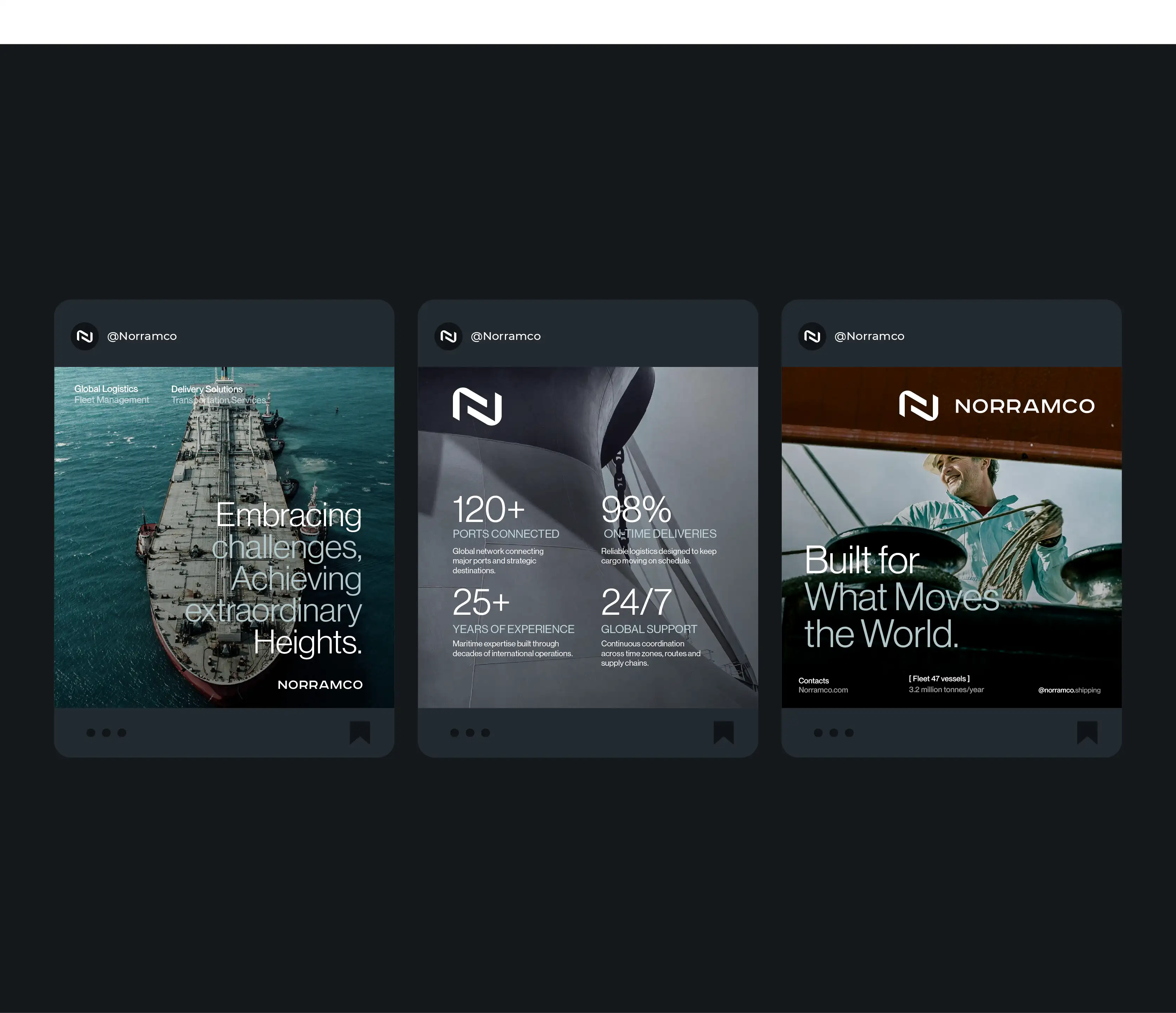
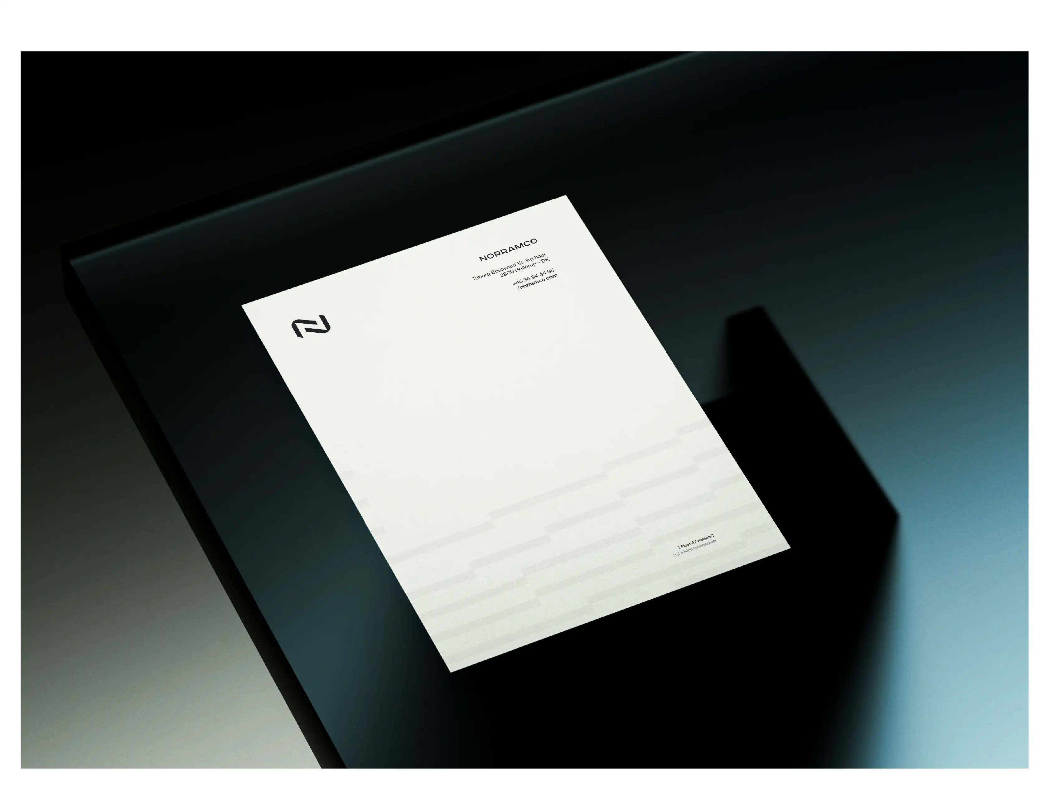
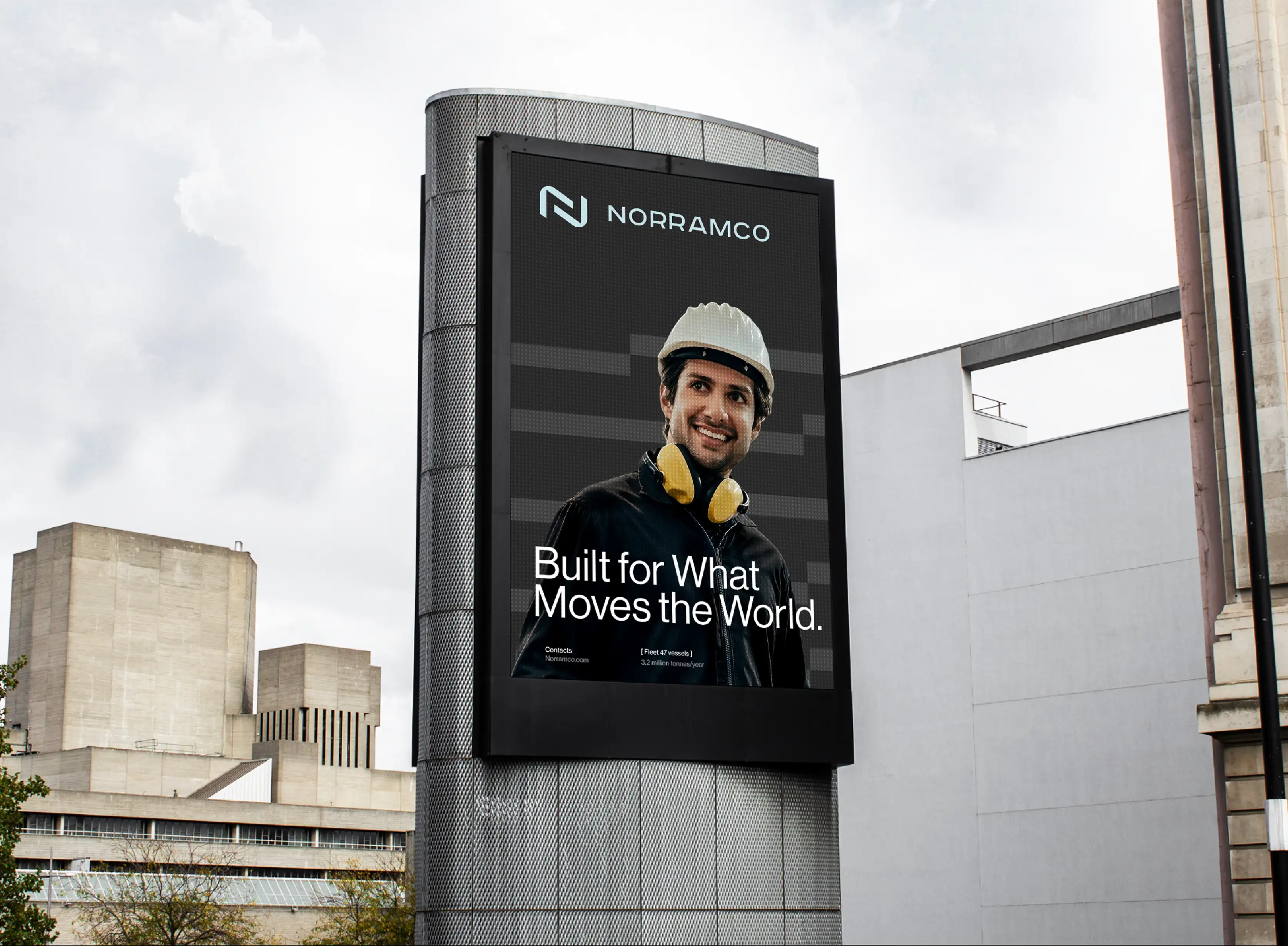
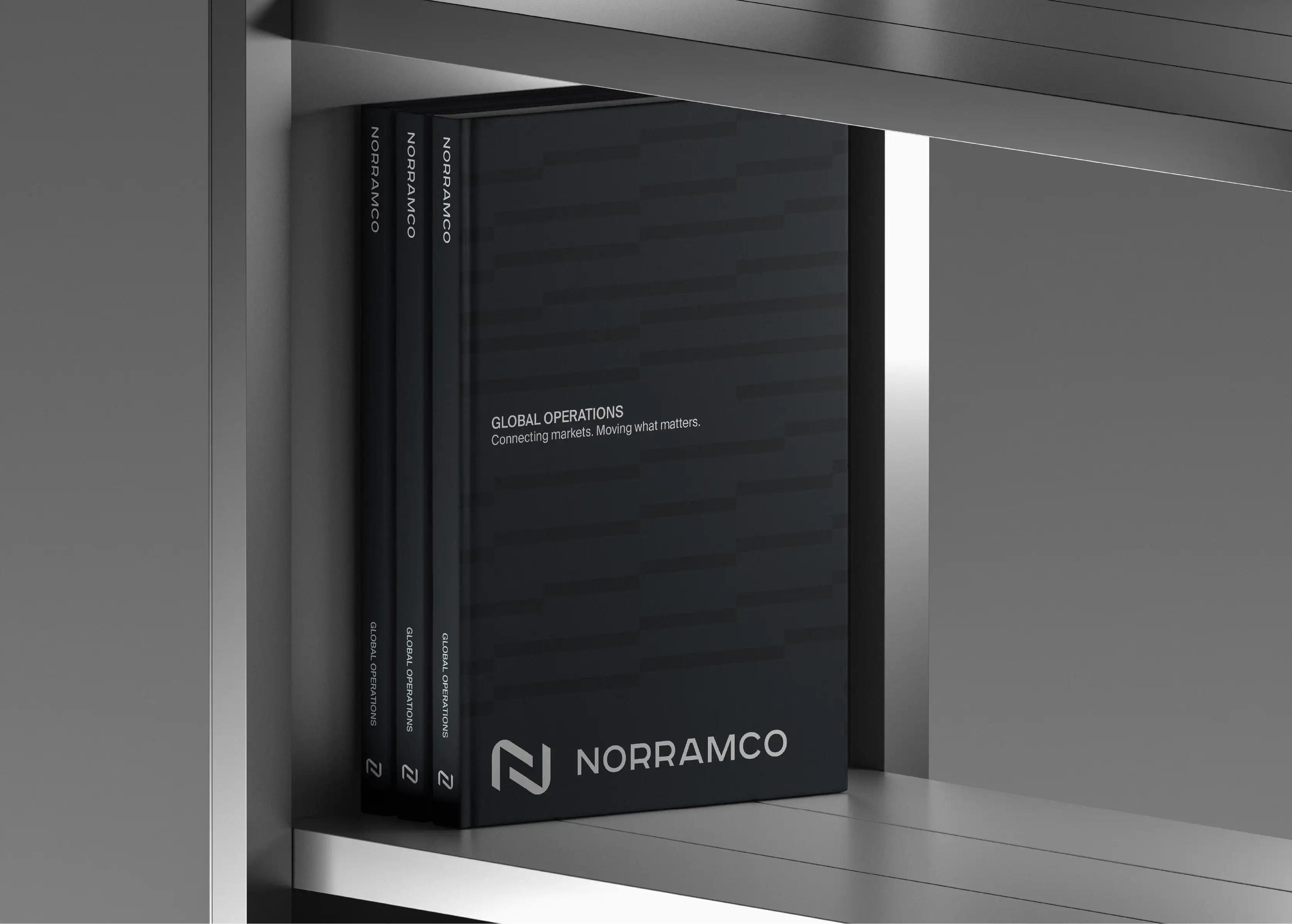
This thinking extends across every context in which the brand needs to operate. Corporate communications, fleet applications, digital platforms and other brand touchpoints draw from the same visual principles, creating consistency without making the identity feel repetitive. The system was designed to remain clear and recognisable at different scales and across different markets.
The result is a corporate identity for a logistics and transportation company with a clear point of view and a stronger relationship between business strategy and design. Rather than competing with other shipping companies through familiar maritime symbols, Norramco now has a visual language that can be recognised, applied consistently and developed as the business continues to grow internationally.