AETHERON
Brand Identity Design for the AI Era
Aetheron — Brand Identity & Visual Strategy
Some companies know exactly who they are. The problem is nobody else does.
Aetheron had a solid vision, a clear positioning, a serious product. What they were missing was a brand identity capable of communicating all of that before saying a single word. The old logo couldn't hold its ground in the enterprise market — and in a sector where credibility is won in seconds, a weak brand isn't an aesthetic problem. It's a business one.
The brief beneath the brief
Every client brings two briefs: the one they write, and the one they don't. The written one said: we want a modern, professional brand design. The unwritten one said: we want to walk into a room with the big players and not look like the smallest one there.
I worked on both.
The choices that matter
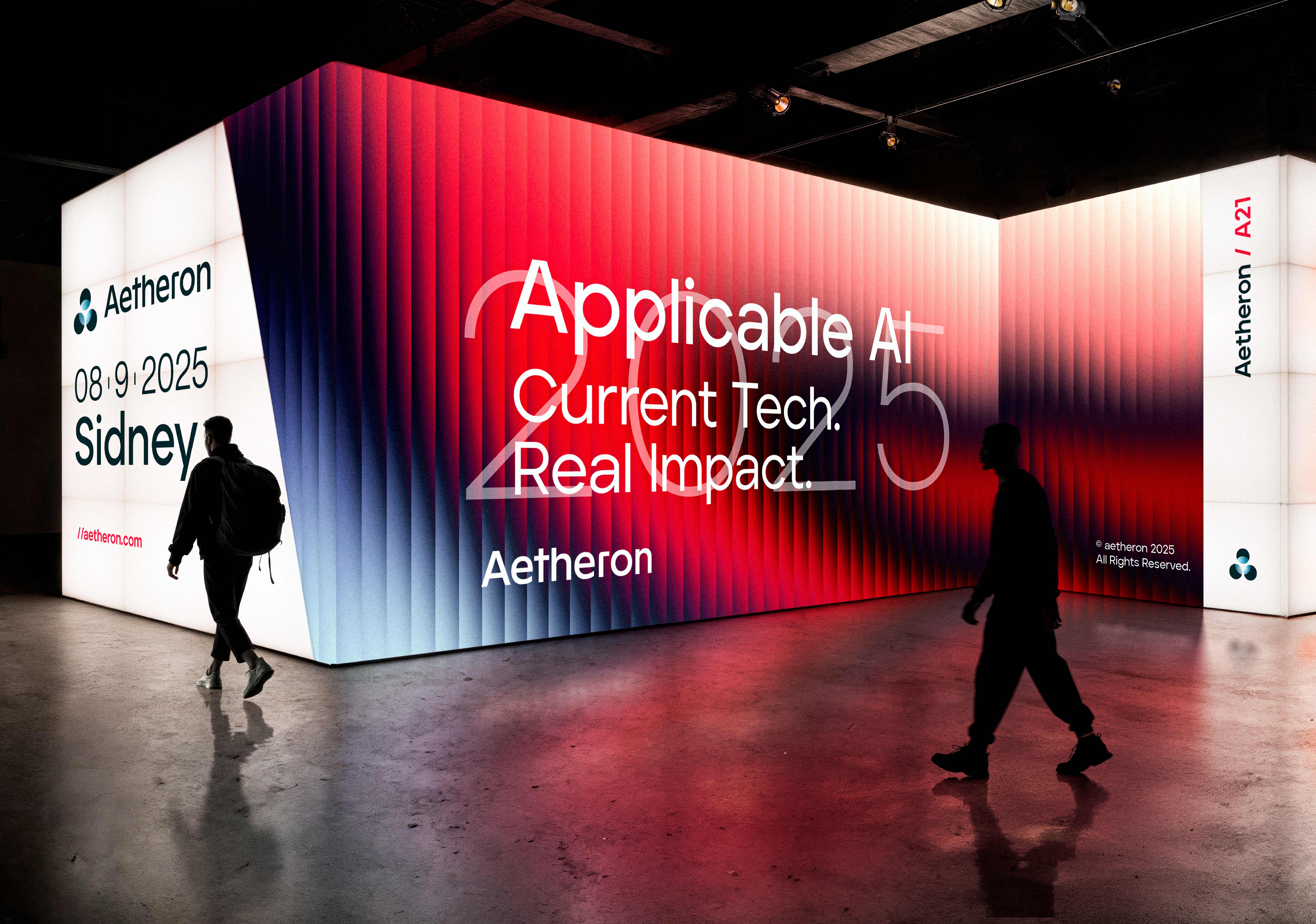
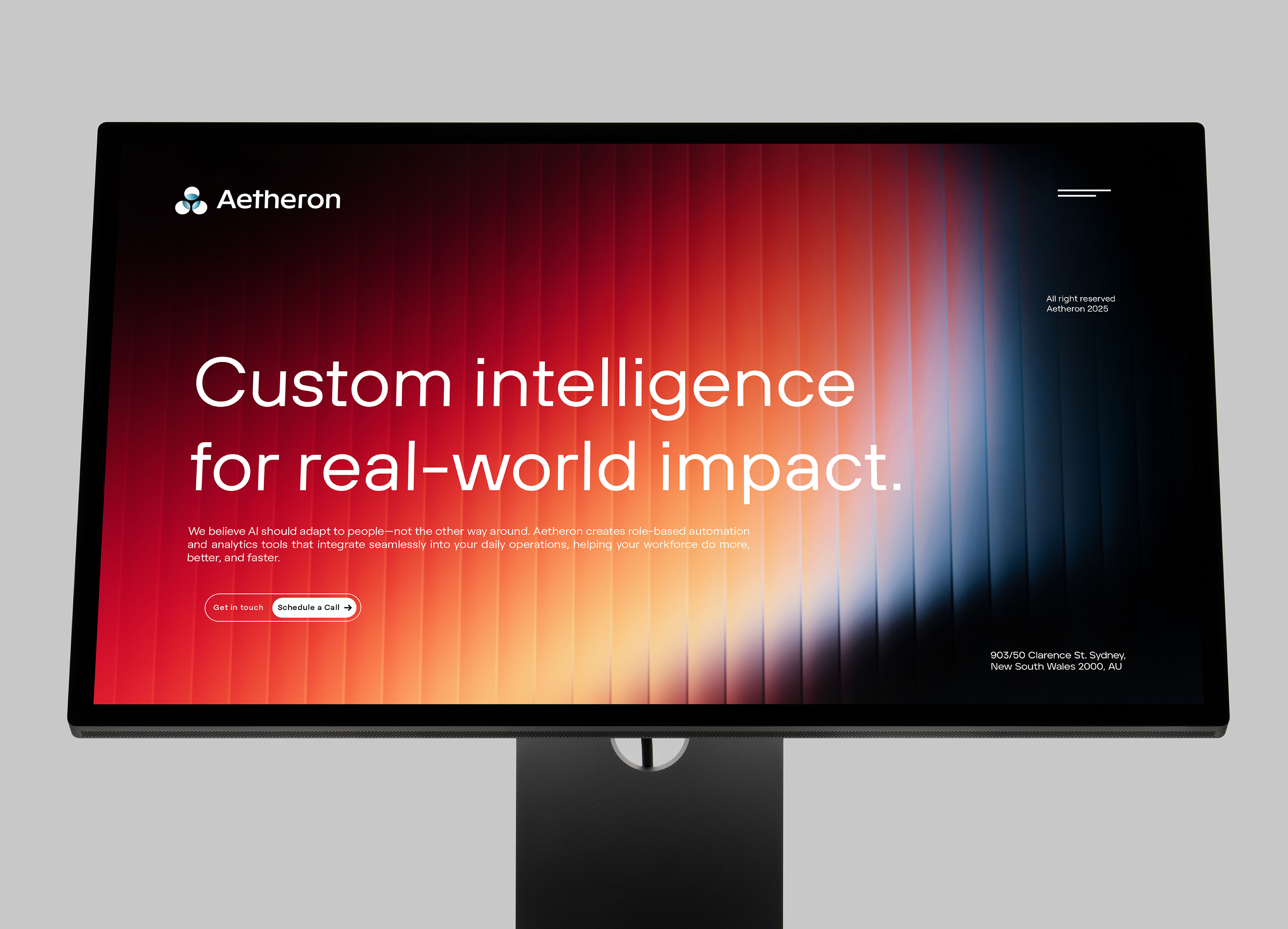
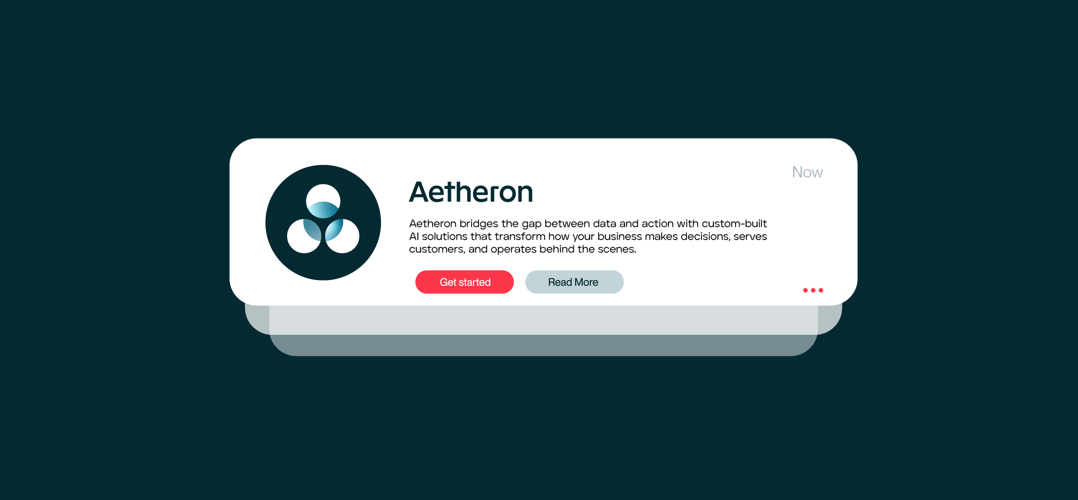
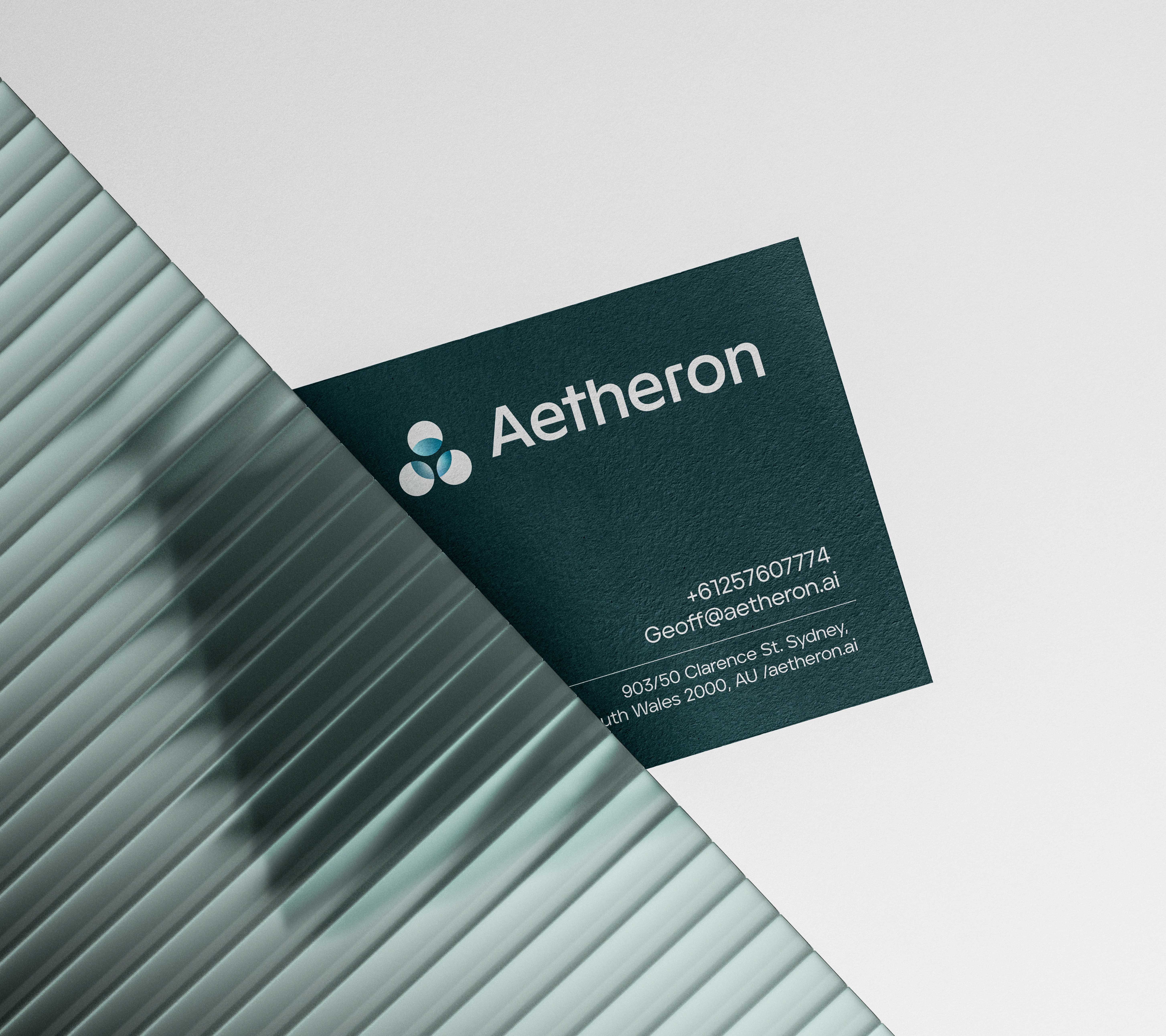
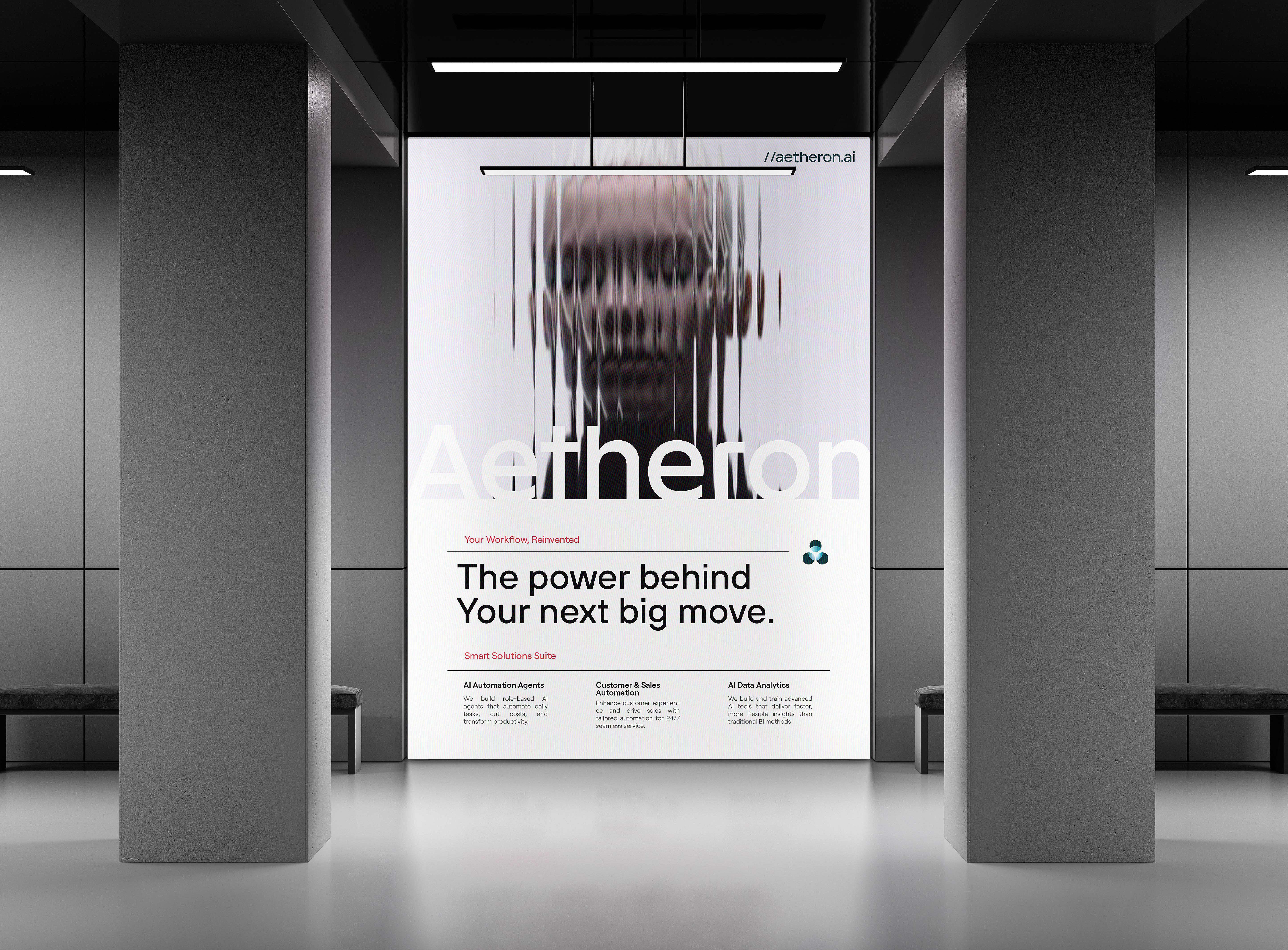
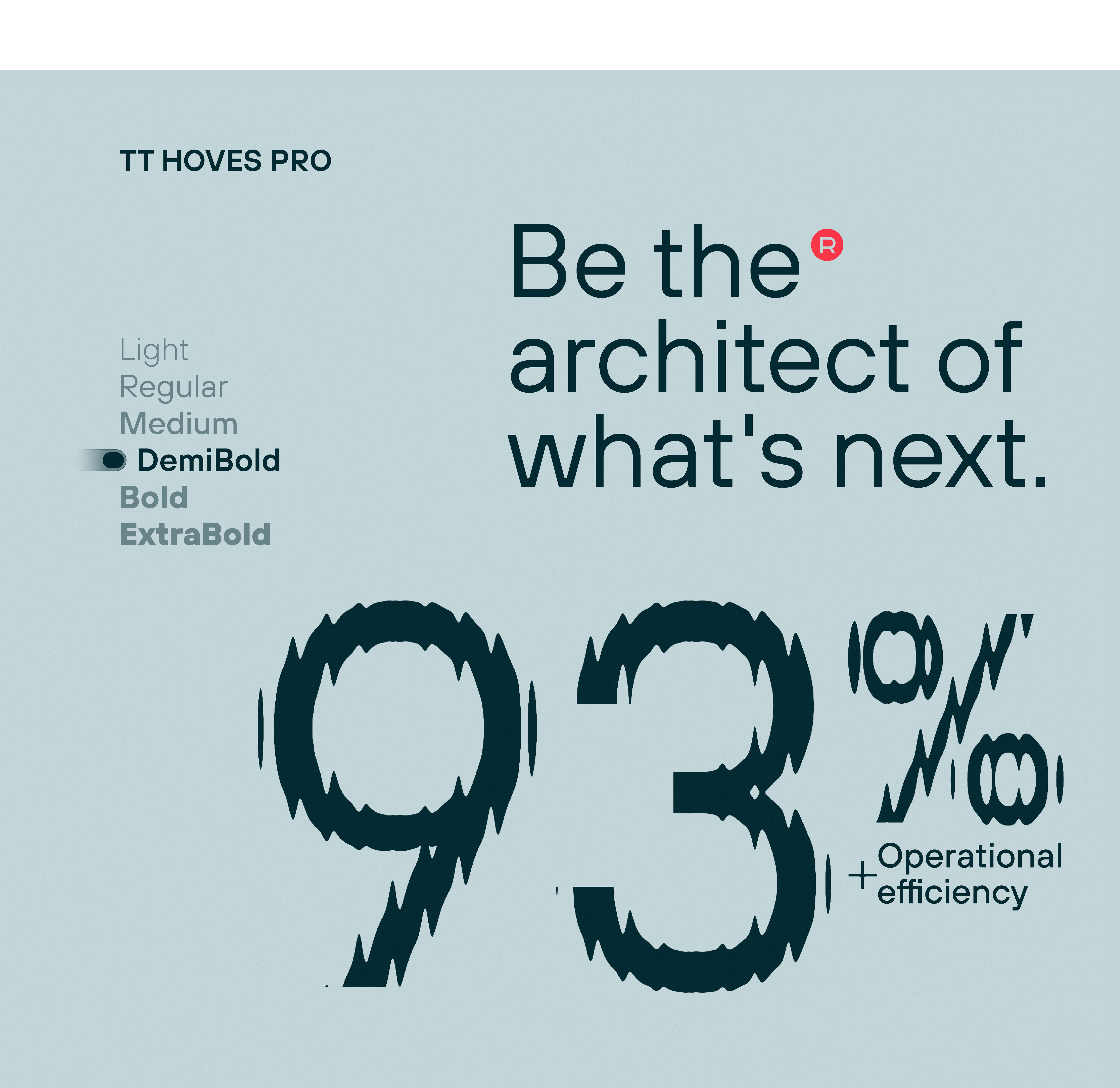
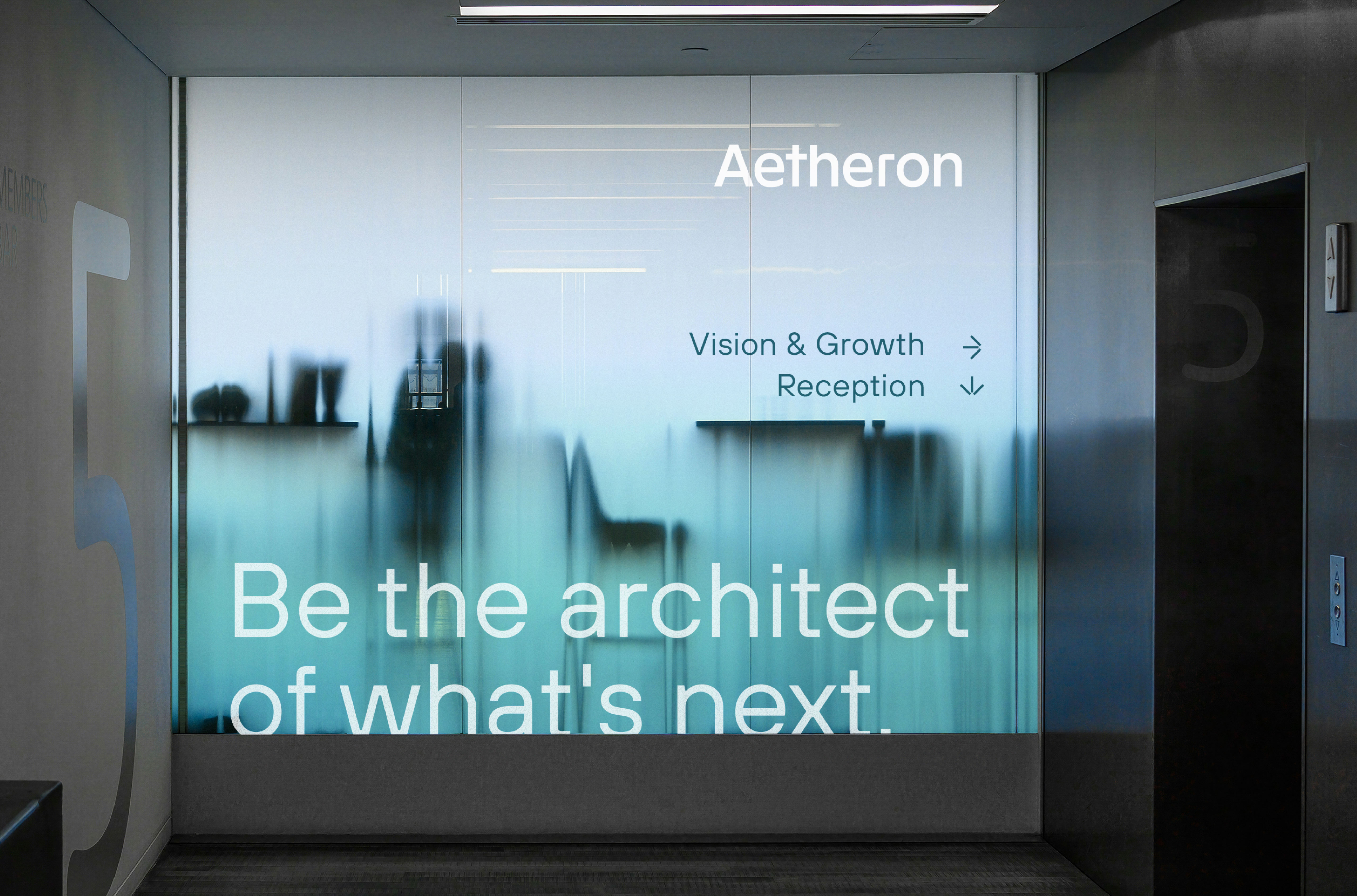
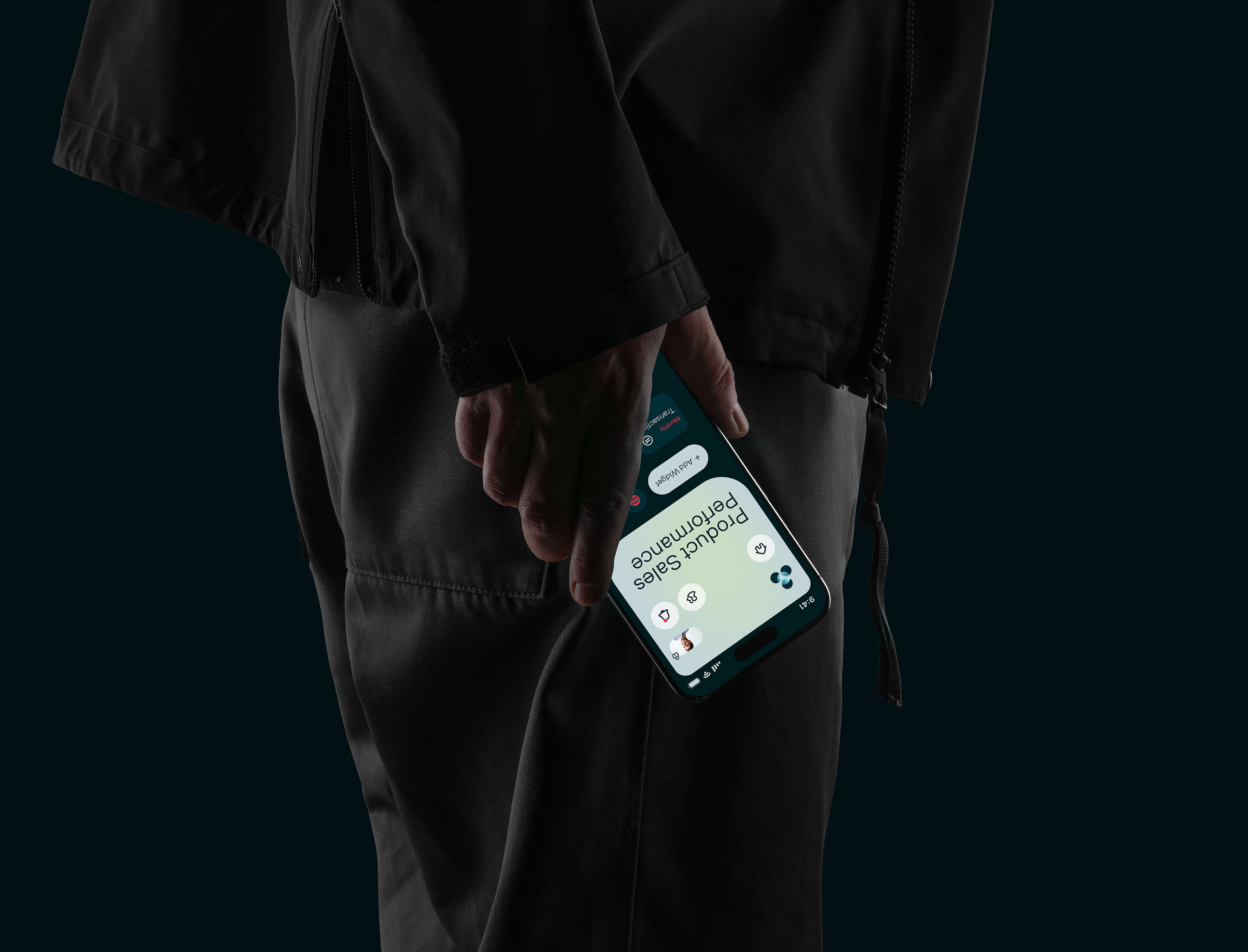
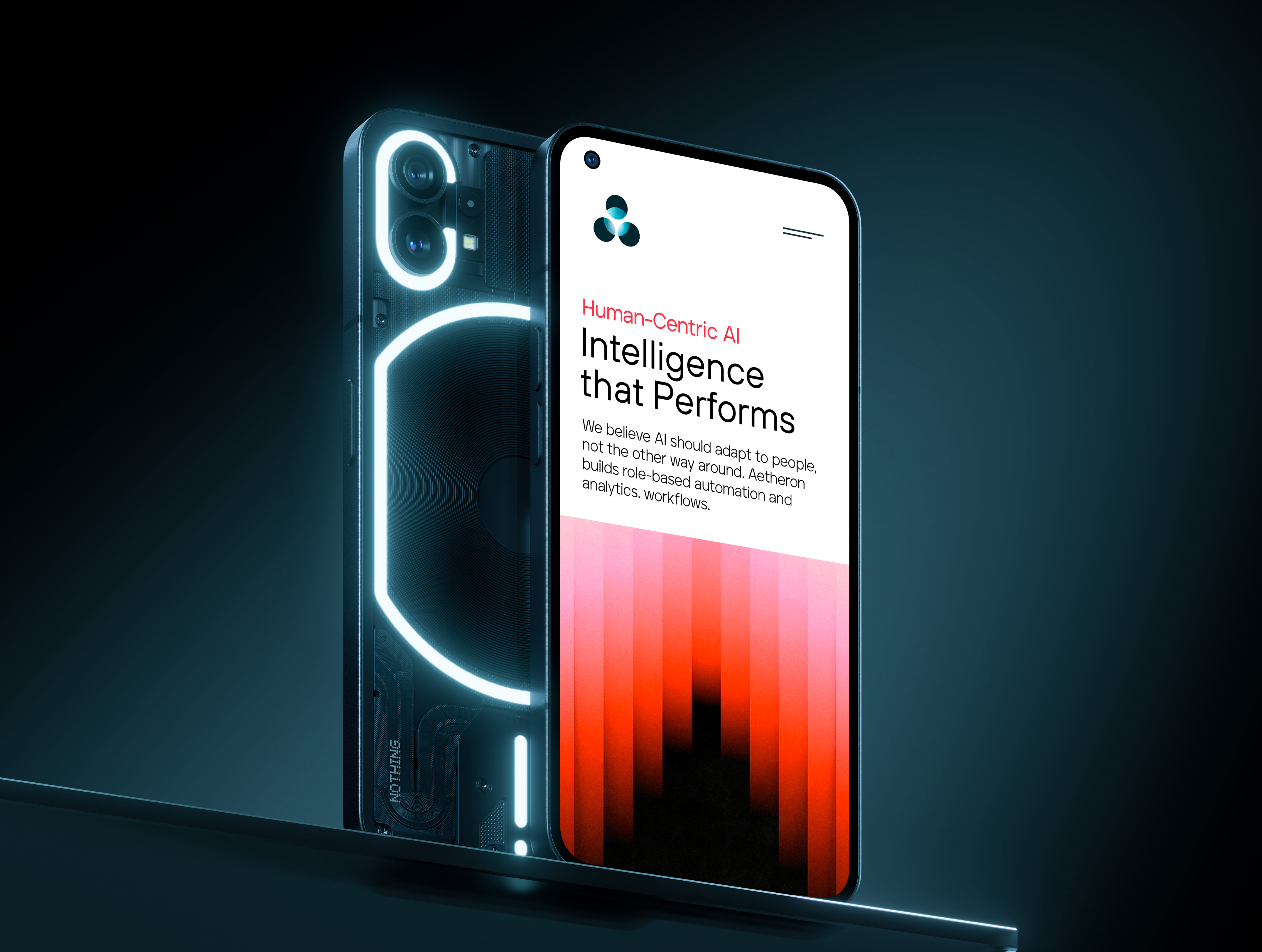
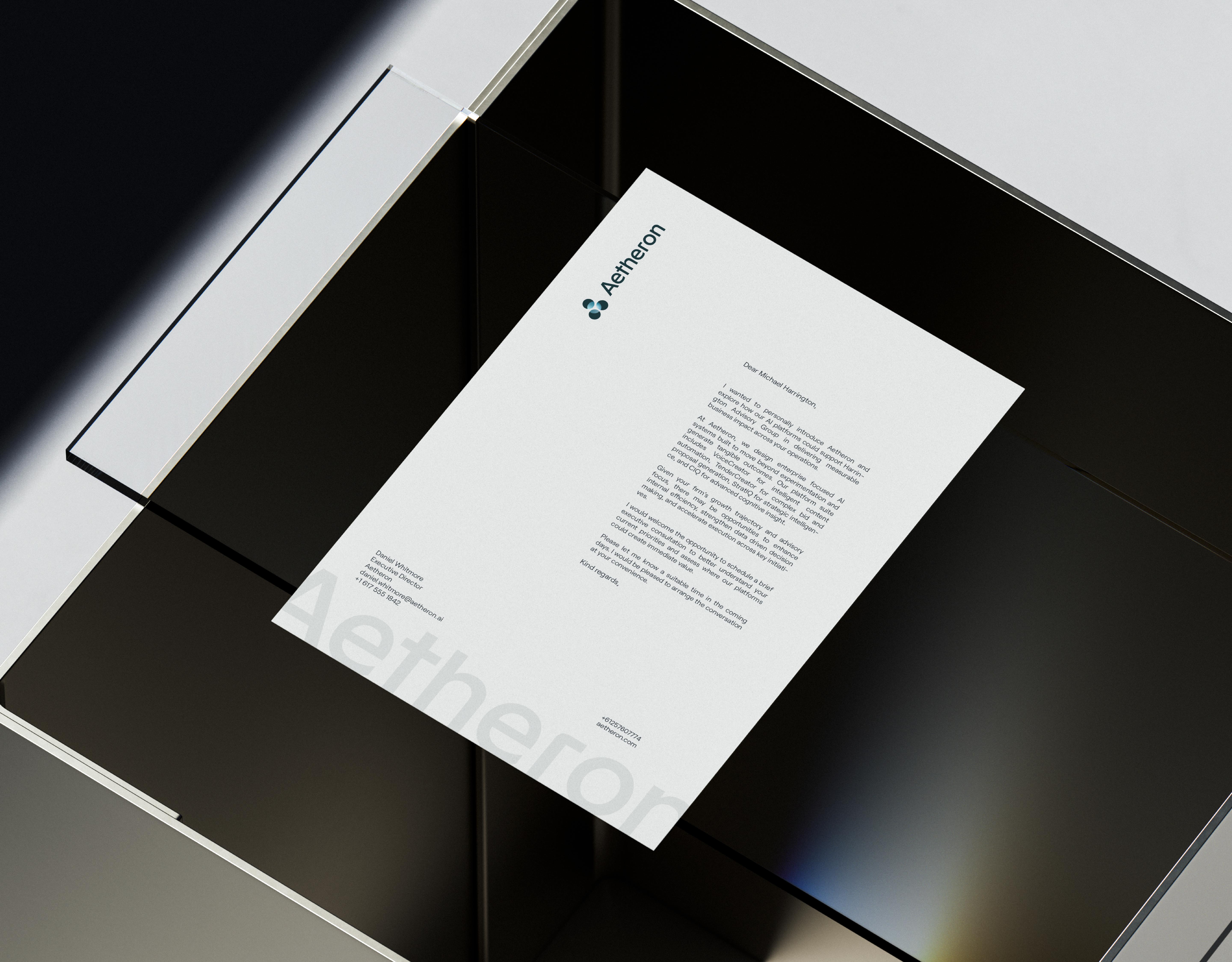
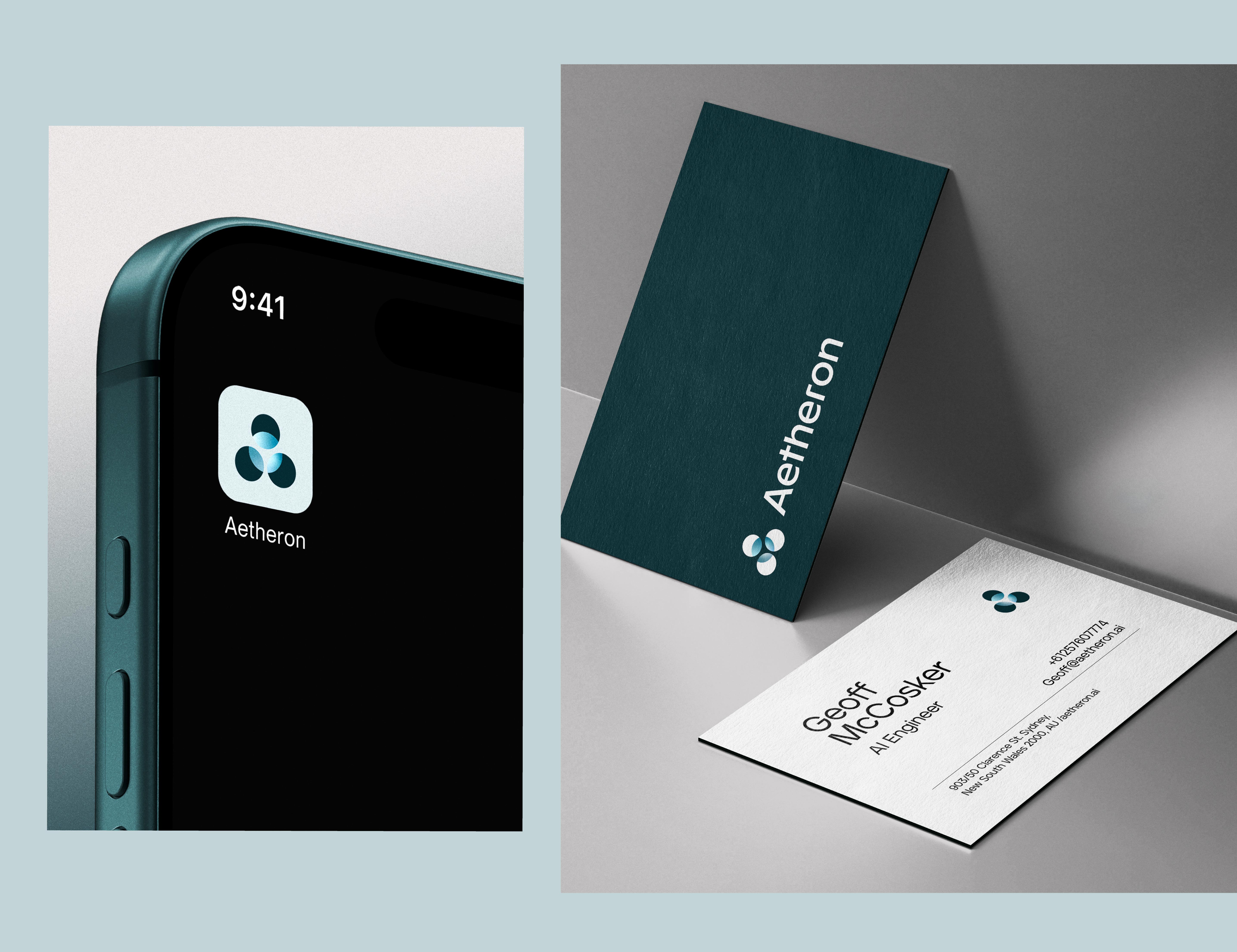
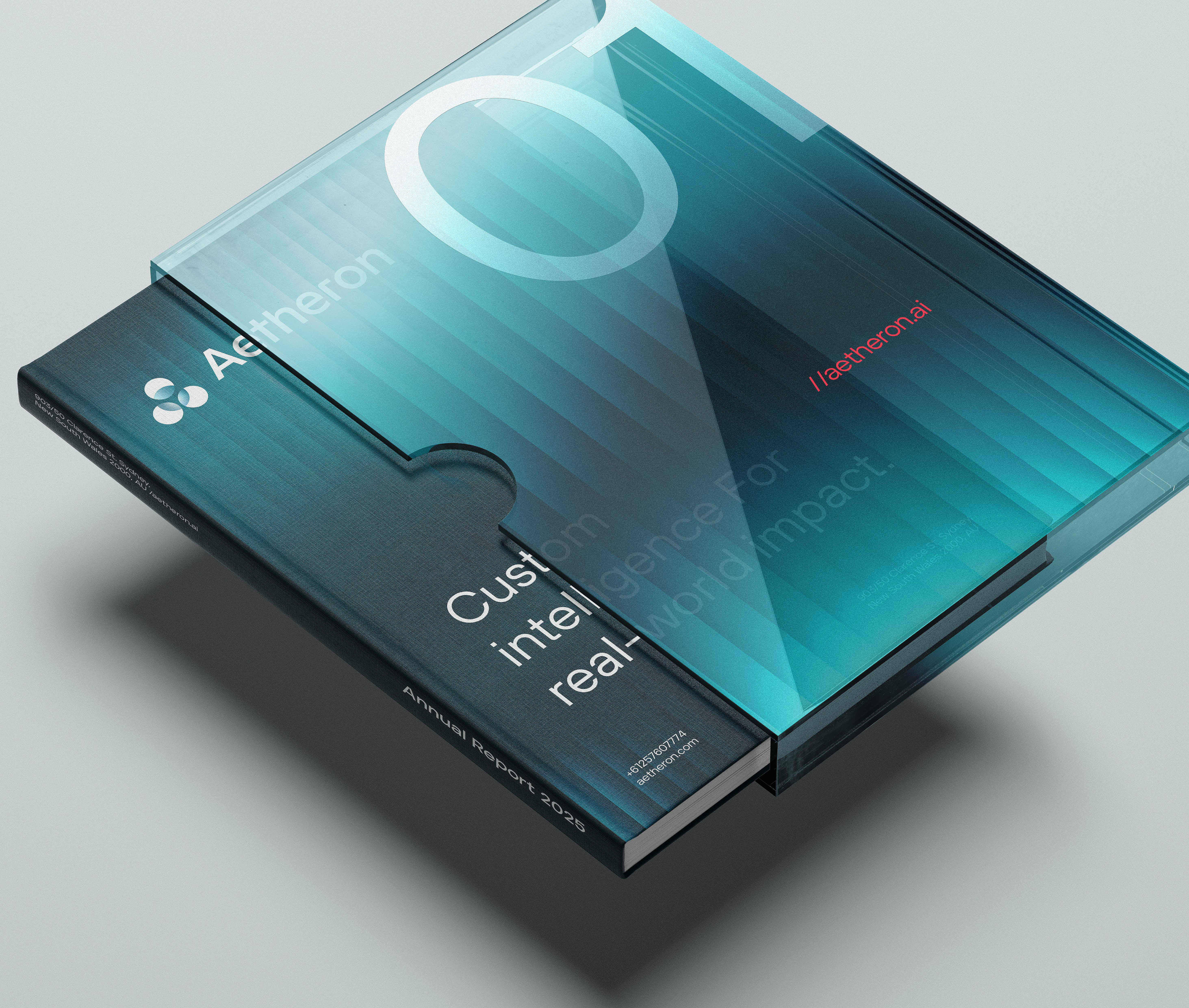
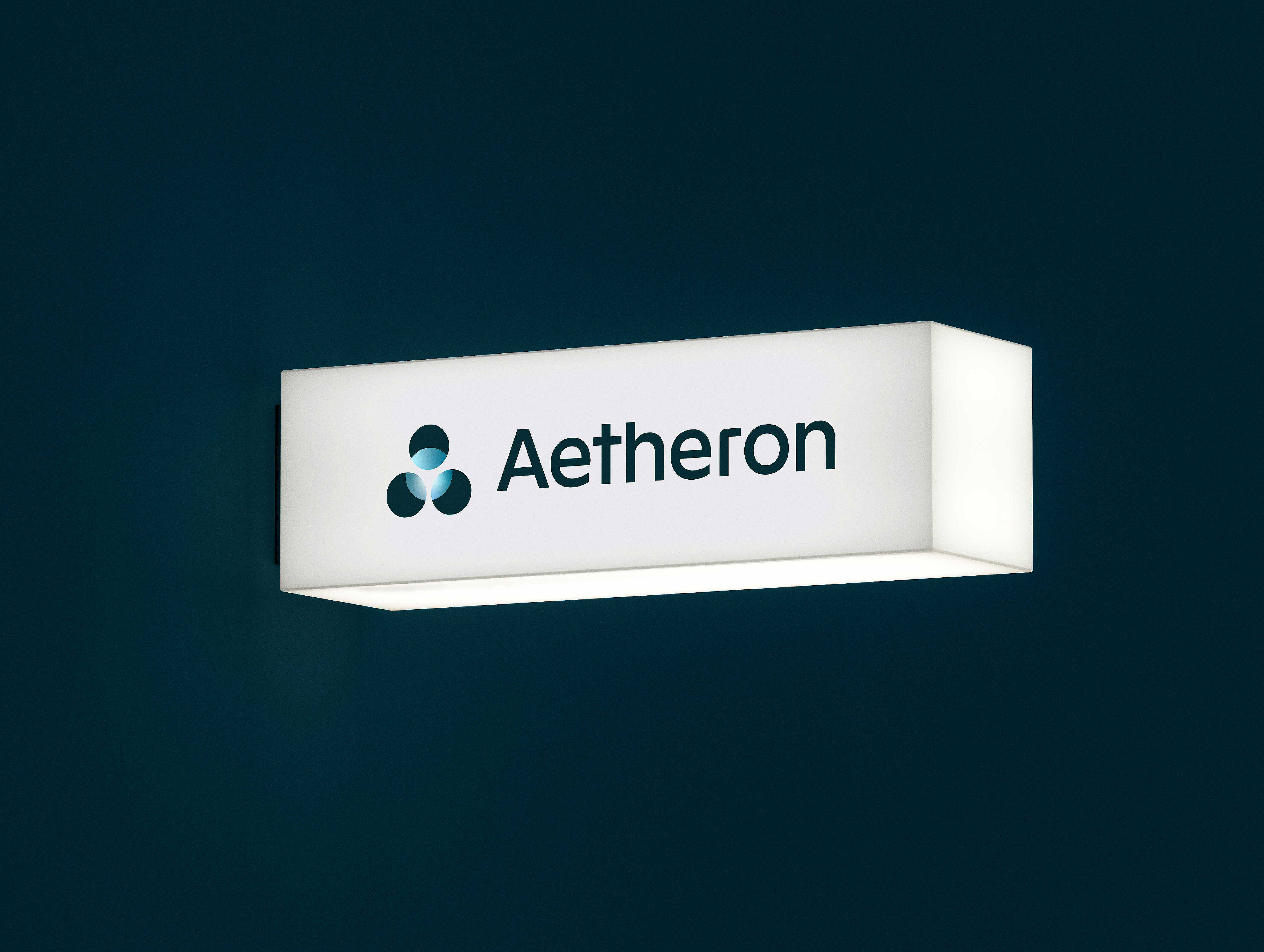
The logo design is rooted in symbolic research: the four circles Torbern Bergman used to identify aether — the element behind the brand's name — adapted and reconstructed to carry two meanings inside a single glyph: the "A" of the brand, and the silhouette of a human figure. Technology that acknowledges people. Scalable at every size, built to be animated, designed to be remembered.
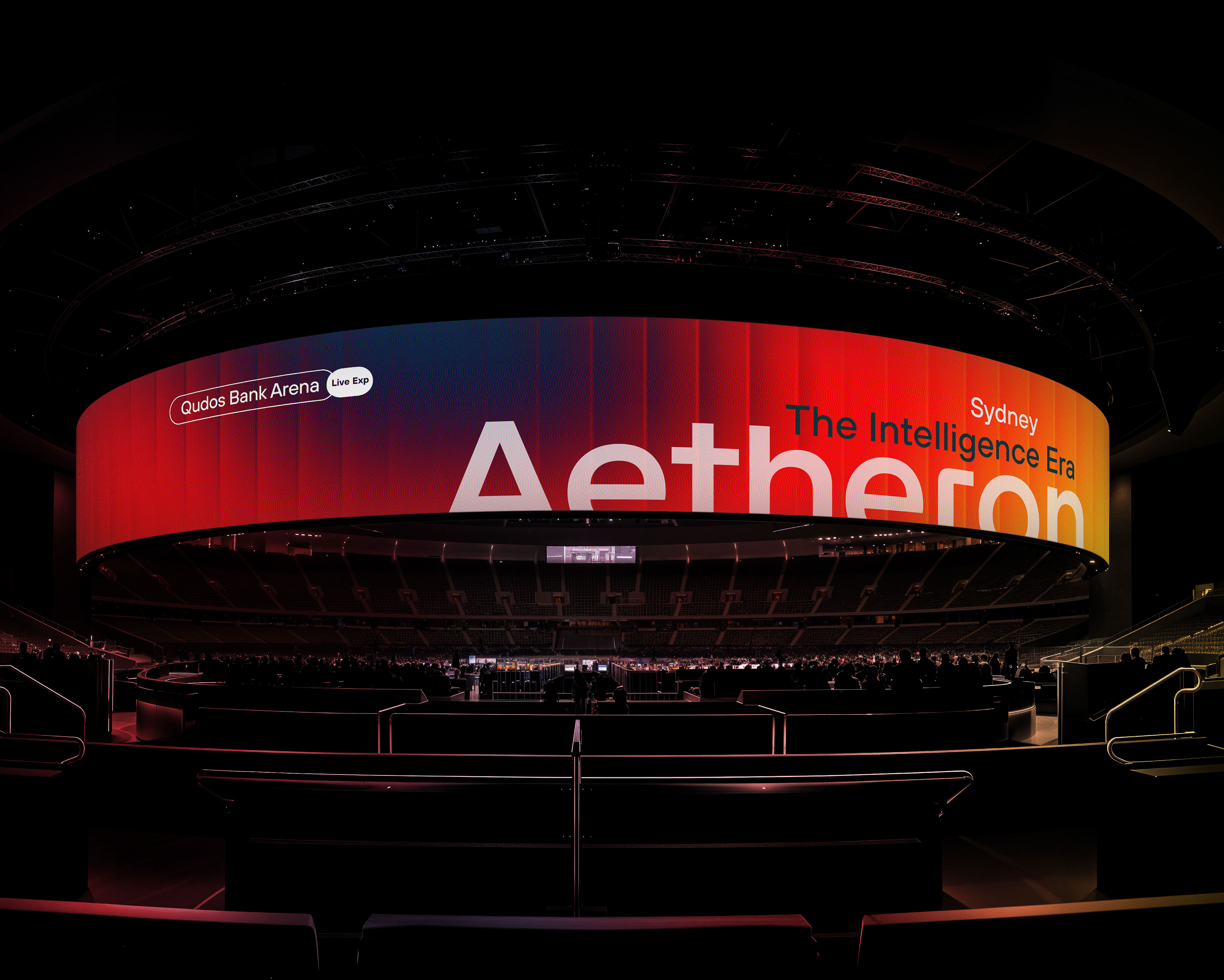
The wordmark exists in no font library. It was rebuilt letterform by letterform to create something proprietary — a mark that belongs only to them.
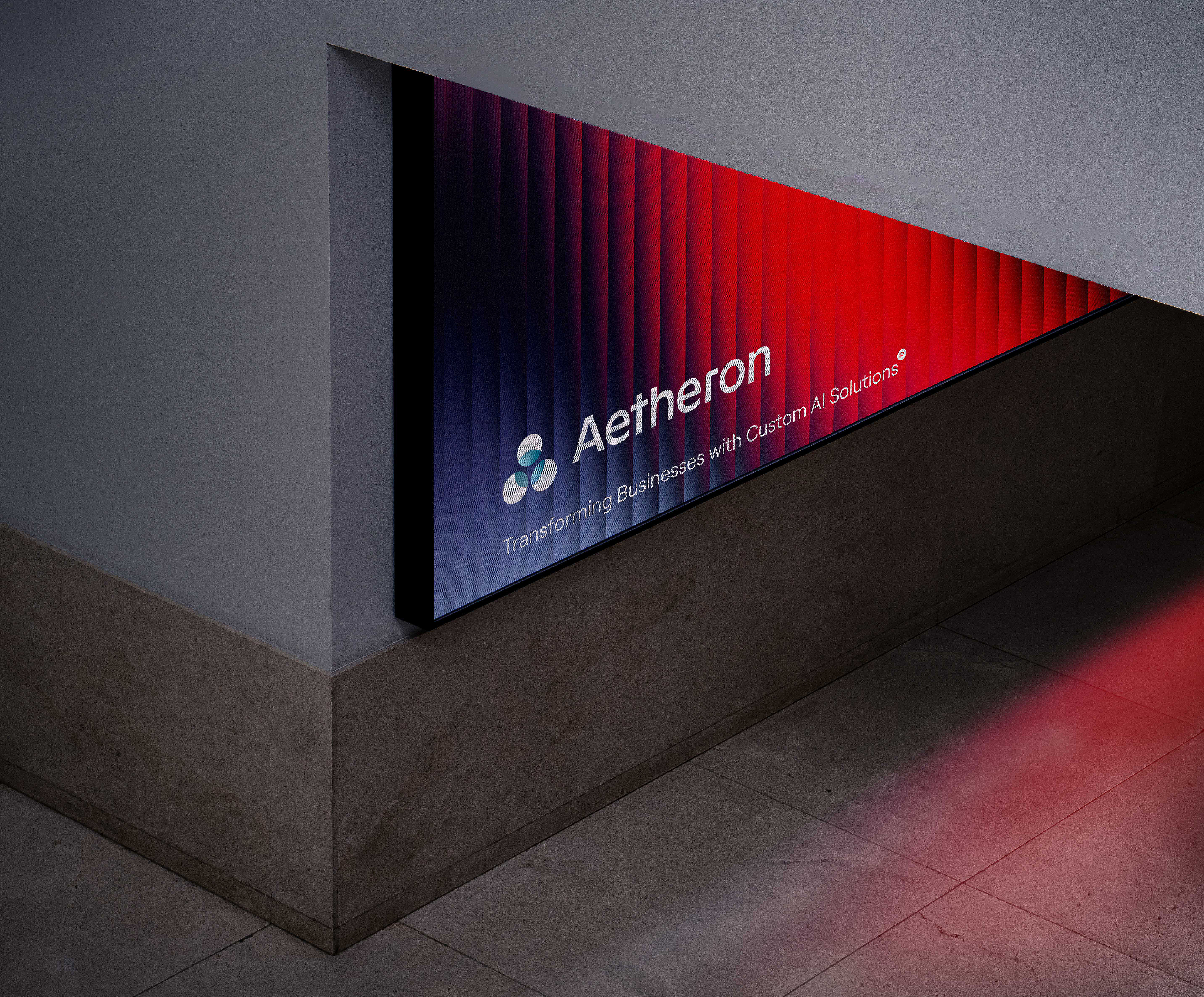
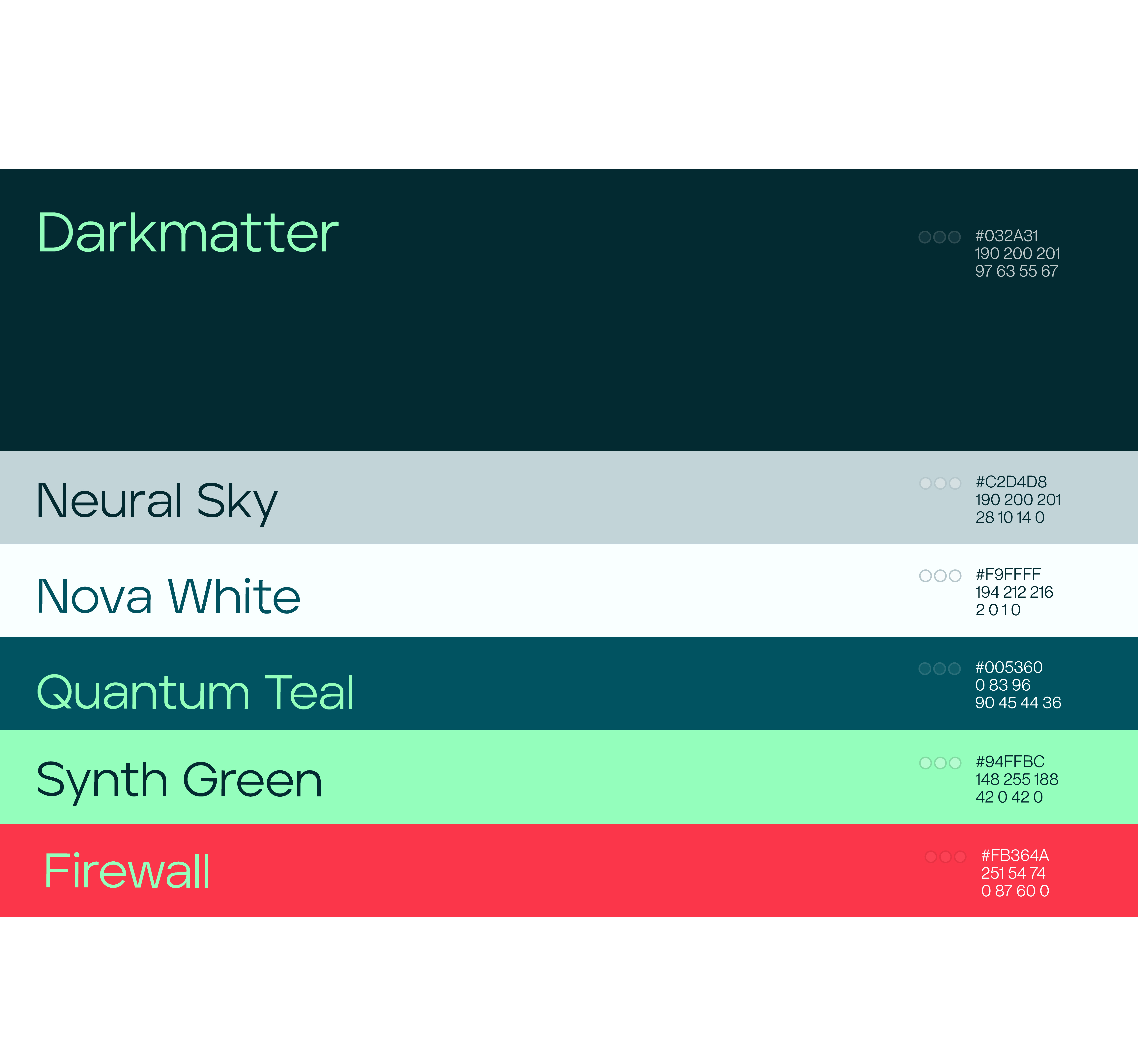
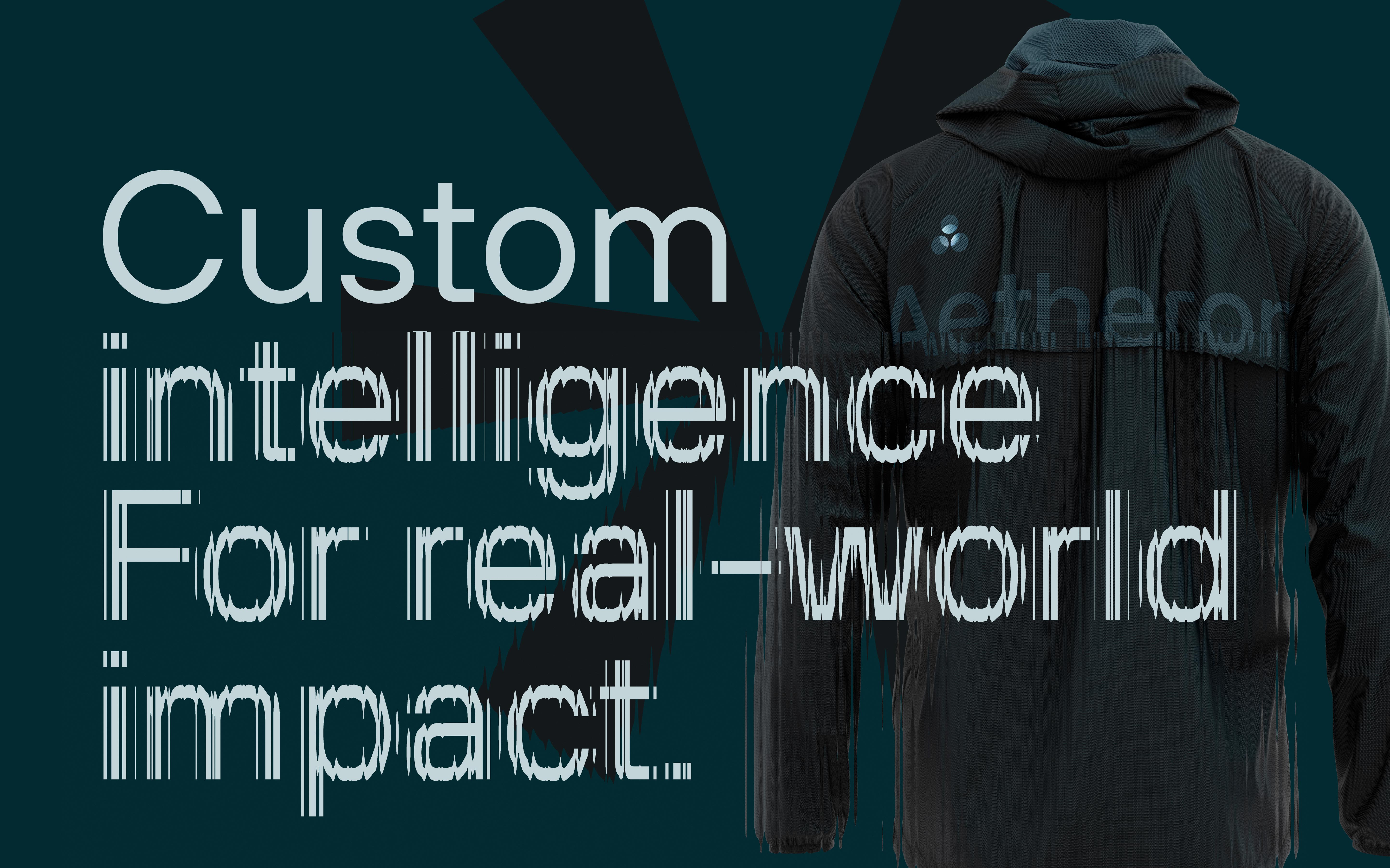
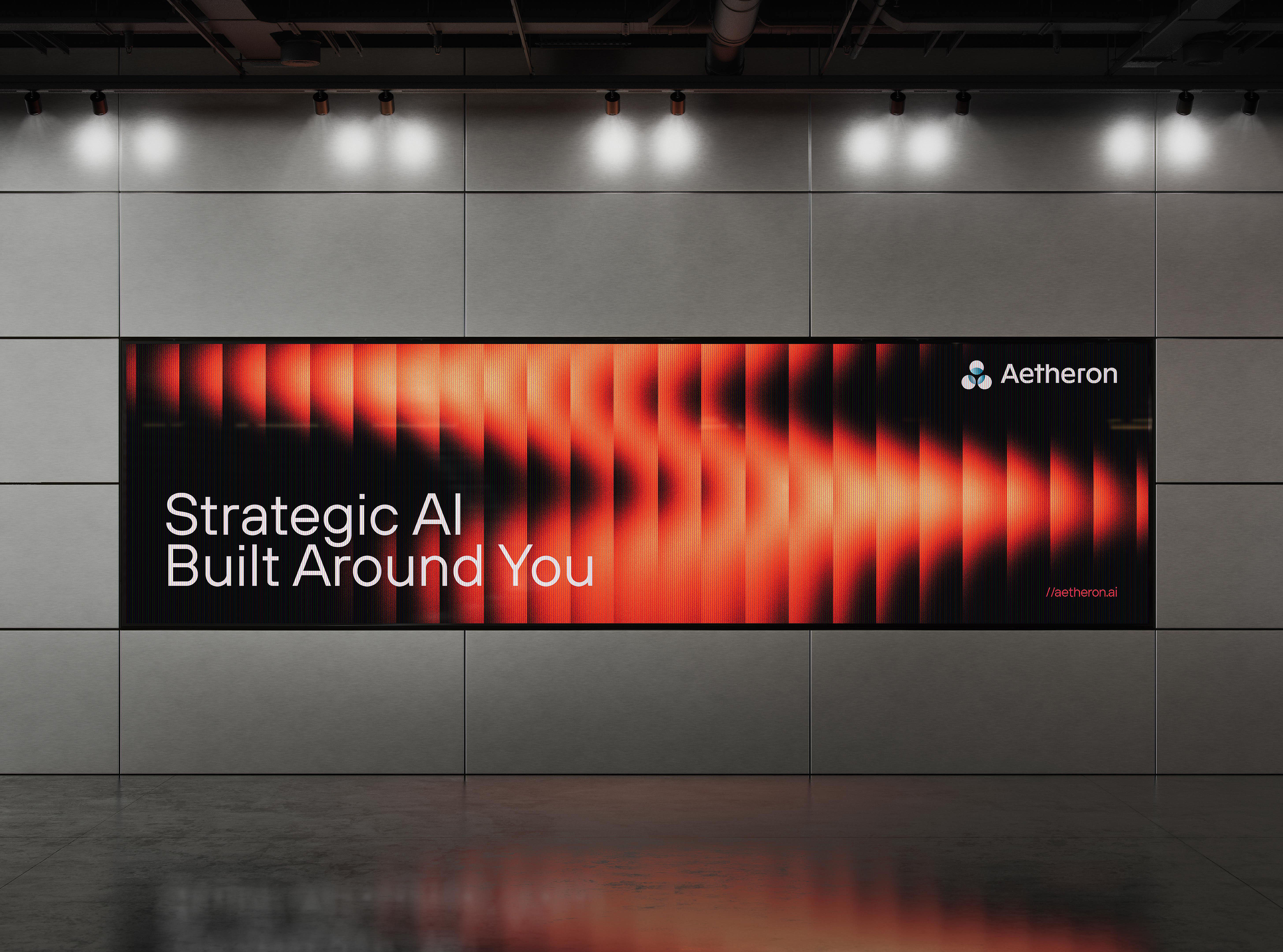
The dark palette with high-intensity chromatic accents positions Aetheron firmly in the premium tier of AI branding without sacrificing energy. The gradients aren't decoration: they're an animatable motion-ready design system that turns every surface into something alive.
What remains
A complete brand system — visual identity, typography, color, and logo — consistent from favicon to billboard. Built to scale. Hard to ignore.